Overview
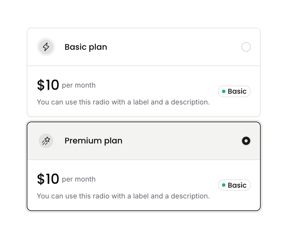
Radio 13 is a styled radio button card component that allows users to select between multiple plan options. Each option displays an icon, a title, a badge, pricing details, and a circular radio indicator. The selected state is managed via a custom state on the parent group, visually updating borders, backgrounds, and the radio icon fill when an option is active.
How to use
Open the Brikl panel
Navigate to the Elements category in the Brikl panel.
Copy the component
Find Radio 13 and click Copy.
Paste into your editor
Paste it into your Bubble canvas with Cmd + V (Mac) or Ctrl + V (Windows),
or right-click on the canvas and select Paste.
States
This component includes conditional states that automatically change its appearance.
| State | Trigger | Visual effect |
|---|
| Selected Option | Custom state ‘radio_item_’ on parent group matches the clicked option’s item | Border color of the option card changes to dark, box shadow spread increases, header background changes to stone, and radio icon switches to filled dot with dark background |
| Unselected Option | Default state when option is not selected | Option card shows default border, radio icon shows as empty circle outline with light border |
These states are handled natively by Bubble and require no additional setup.
They will work automatically once the component is pasted into your editor.
Responsive
This component adapts to mobile screens. Font sizes and layout automatically adjust on screens smaller than Bubble’s built-in mobile breakpoint.
Workflows
This component includes pre-built workflows.
| Trigger | Action |
|---|
| GP - Option 1 (Radio 13) is clicked | Sets custom state ‘radio_item_’ on the parent group to the current item of Option 1 |
| GP - Option 2 (Radio 13) is clicked | Sets custom state ‘radio_item_’ on the parent group to the current item of Option 2 |
These workflows are included when you use the Copy with Workflows option in the Brikl panel.
Requirements
| |
|---|
| License | Starter plan required |
| Plugins | None |
| Custom code | Not required |
| Platform | Supported |
|---|
| Web | ✅ |
| Mobile | ✅ |
License
This component requires a Starter plan.