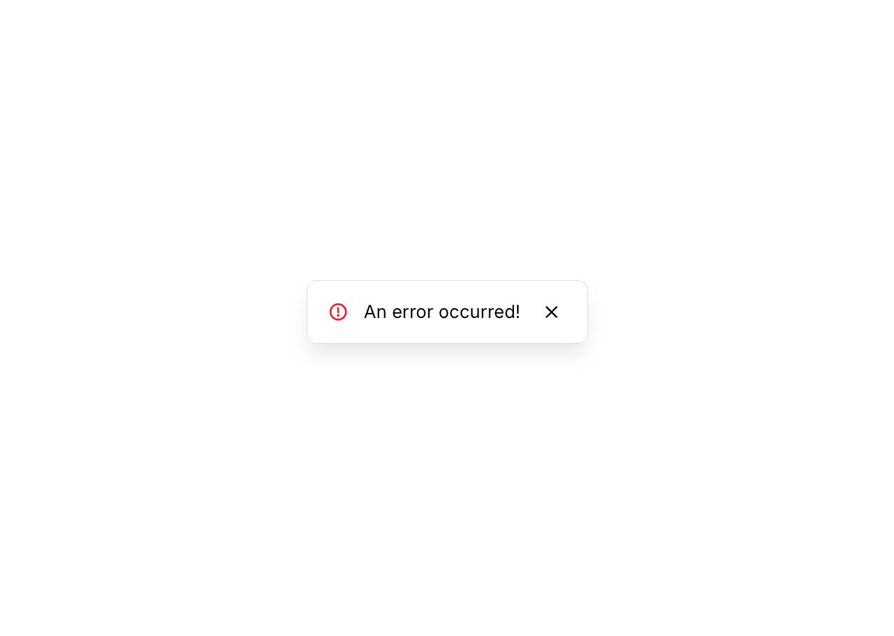
Overview
Alert 06 is a floating group toast-style alert component that appears at the bottom of the screen to notify users of an error. It slides up into view automatically, remains visible for 5 seconds, then slides back down and hides. Users can also manually dismiss it by clicking the close (X) button. It is designed for non-intrusive, temporary error feedback.
How to use
Open the Brikl panel
Navigate to the Elements category in the Brikl panel.
Copy the component
Find Alert 06 and click Copy.
Paste into your editor
Paste it into your Bubble canvas with Cmd + V (Mac) or Ctrl + V (Windows),
or right-click on the canvas and select Paste.
States
This component includes conditional states that automatically change its appearance.
| State | Trigger | Visual effect |
|---|
| Hovered | User hovers over the close button | The close button icon color changes to a semi-transparent dark tone (rgba(11,8,9,0.6)) |
| Not Clickable | Button is in a non-clickable state | The close button opacity is reduced to 50% |
These states are handled natively by Bubble and require no additional setup.
They will work automatically once the component is pasted into your editor.
Responsive
This component adapts to mobile screens. Font sizes and layout automatically adjust on screens smaller than Bubble’s built-in mobile breakpoint.
Workflows
This component includes pre-built workflows.
| Trigger | Action |
|---|
| Close button (BT - Hide FG Alert 06) is clicked | Animates the floating group out with a slideDownOut transition (500ms), then hides it |
| Trigger button (BT - Trigger Alert 06) is clicked | Shows the floating group, animates it in with slideUpIn (500ms), waits 5 seconds, then animates it out with slideDownOut (500ms) and hides it |
These workflows are included when you use the Copy with Workflows option in the Brikl panel.
Requirements
| |
|---|
| License | Starter plan required |
| Plugins | None |
| Custom code | Not required |
| Platform | Supported |
|---|
| Web | ✅ |
| Mobile | ✅ |
License
This component requires a Starter plan.