Overview
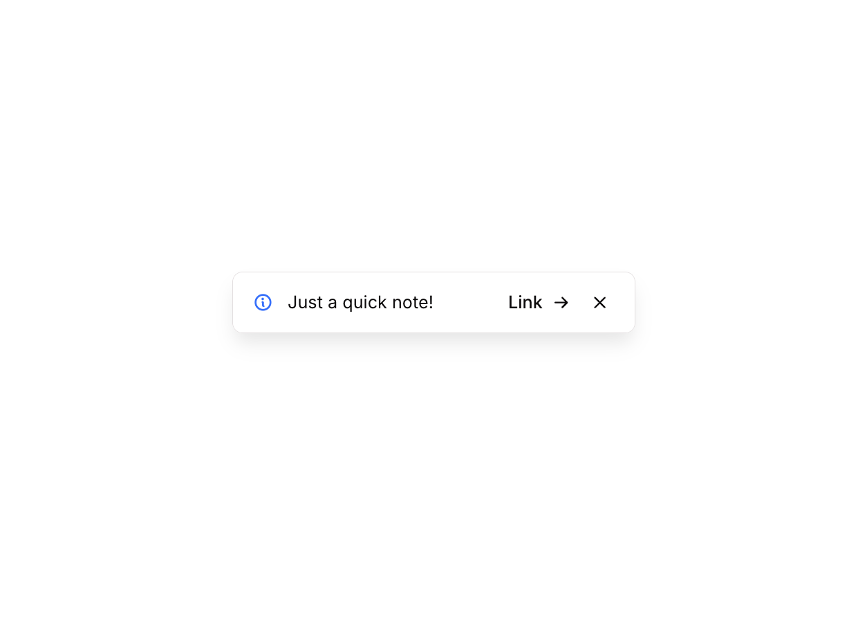
Alert 12 is a floating notification component that appears anchored to the bottom-right corner of the screen. It displays an informational message with an icon, a short title, an optional action link, and a dismiss (close) button. It is designed to provide non-intrusive contextual feedback or announcements to users, and can be hidden via a slide-down animation when the close button is clicked.
How to use
Open the Brikl panel
Navigate to the Elements category in the Brikl panel.
Copy the component
Find Alert 12 and click Copy.
Paste into your editor
Paste it into your Bubble canvas with Cmd + V (Mac) or Ctrl + V (Windows),
or right-click on the canvas and select Paste.
States
This component includes conditional states that automatically change its appearance.
| State | Trigger | Visual effect |
|---|
| Link Hovered | User hovers over the Link button | Link button opacity reduces to 70% and underline is applied |
| Link Not Clickable | Link button is set to non-clickable | Link button opacity reduces to 50% |
| Close Button Hovered | User hovers over the close (X) button | Close button icon color changes to rgba(11,8,9,0.6) |
| Close Button Not Clickable | Close button is set to non-clickable | Close button opacity reduces to 50% |
| Close Button Hidden on Small Screen | Current page width is less than or equal to 596px | Close button becomes invisible |
These states are handled natively by Bubble and require no additional setup.
They will work automatically once the component is pasted into your editor.
Responsive
This component adapts to mobile screens. Font sizes and layout automatically adjust on screens smaller than Bubble’s built-in mobile breakpoint.
Workflows
This component includes pre-built workflows.
| Trigger | Action |
|---|
| BT - Hide FG (Alert 12) is clicked | Animates the floating group with a slideDownOut transition (500ms duration), then hides the floating group element |
These workflows are included when you use the Copy with Workflows option in the Brikl panel.
Requirements
| |
|---|
| License | Starter plan required |
| Plugins | None |
| Custom code | Not required |
| Platform | Supported |
|---|
| Web | ✅ |
| Mobile | ✅ |
License
This component requires a Starter plan.