Overview
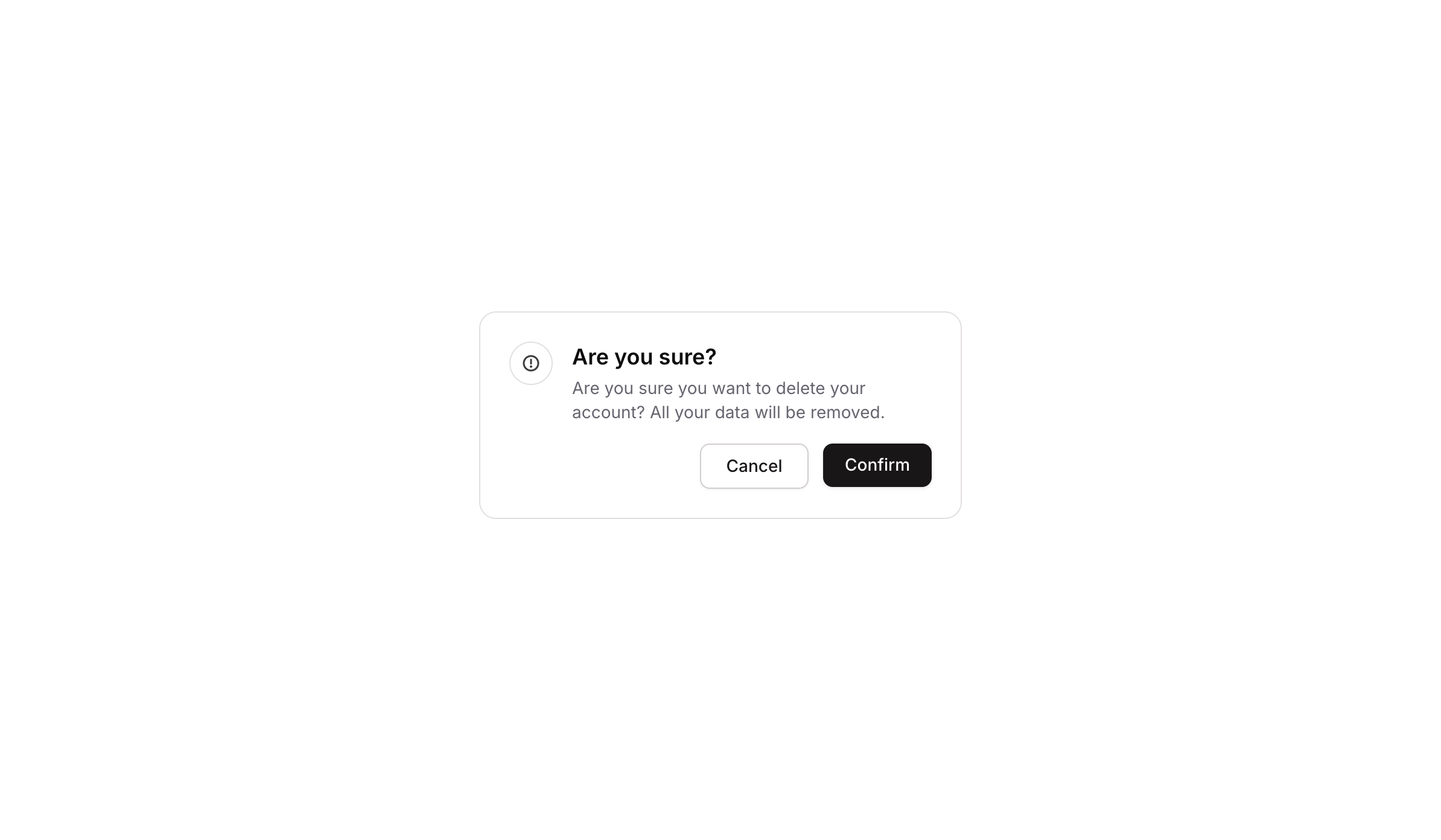
Popup 02 is a confirmation dialog component designed to prompt users before performing a destructive or important action, such as deleting an account. It features a warning icon, a bold heading (‘Are you sure?’), a descriptive message, and two action buttons: Cancel (dismisses the popup) and Confirm (proceeds with the action). The layout is clean and minimal with a white card, rounded corners, and subtle shadow styling.
How to use
Open the Brikl panel
Navigate to the Elements category in the Brikl panel.
Copy the component
Find Popup 02 and click Copy.
Paste into your editor
Paste it into your Bubble canvas with Cmd + V (Mac) or Ctrl + V (Windows),
or right-click on the canvas and select Paste.
States
This component includes conditional states that automatically change its appearance.
| State | Trigger | Visual effect |
|---|
| Cancel Button Hovered | User hovers over the Cancel button | Background color changes to rgba(245, 244, 244, 1) — a light grey tint |
| Cancel Button Disabled | Cancel button is not clickable | Button opacity reduces to 50%, visually indicating it is inactive |
| Confirm Button Hovered | User hovers over the Confirm button | Button opacity reduces to 90%, giving a subtle dimming feedback |
| Confirm Button Disabled | Confirm button is not clickable | Button opacity reduces to 50%, visually indicating it is inactive |
| Mobile Breakpoint - Title Text | Current page width is less than the built-in mobile breakpoint | Heading text font size reduces to 14px |
| Mobile Breakpoint - Body Text | Current page width is less than the built-in mobile breakpoint | Body description text font size reduces to 14px |
These states are handled natively by Bubble and require no additional setup.
They will work automatically once the component is pasted into your editor.
Responsive
This component adapts to mobile screens. Font sizes and layout automatically adjust on screens smaller than Bubble’s built-in mobile breakpoint.
Workflows
This component includes pre-built workflows.
| Trigger | Action |
|---|
| BT - Cancel (Popup 02) is clicked | Hides the Popup 02 element |
| An external trigger button (bTUFy) is clicked | Shows the Popup 02 element |
These workflows are included when you use the Copy with Workflows option in the Brikl panel.
Requirements
| |
|---|
| License | Starter plan required |
| Plugins | None |
| Custom code | Not required |
| Platform | Supported |
|---|
| Web | ✅ |
| Mobile | ❌ |
License
This component requires a Starter plan.