Overview
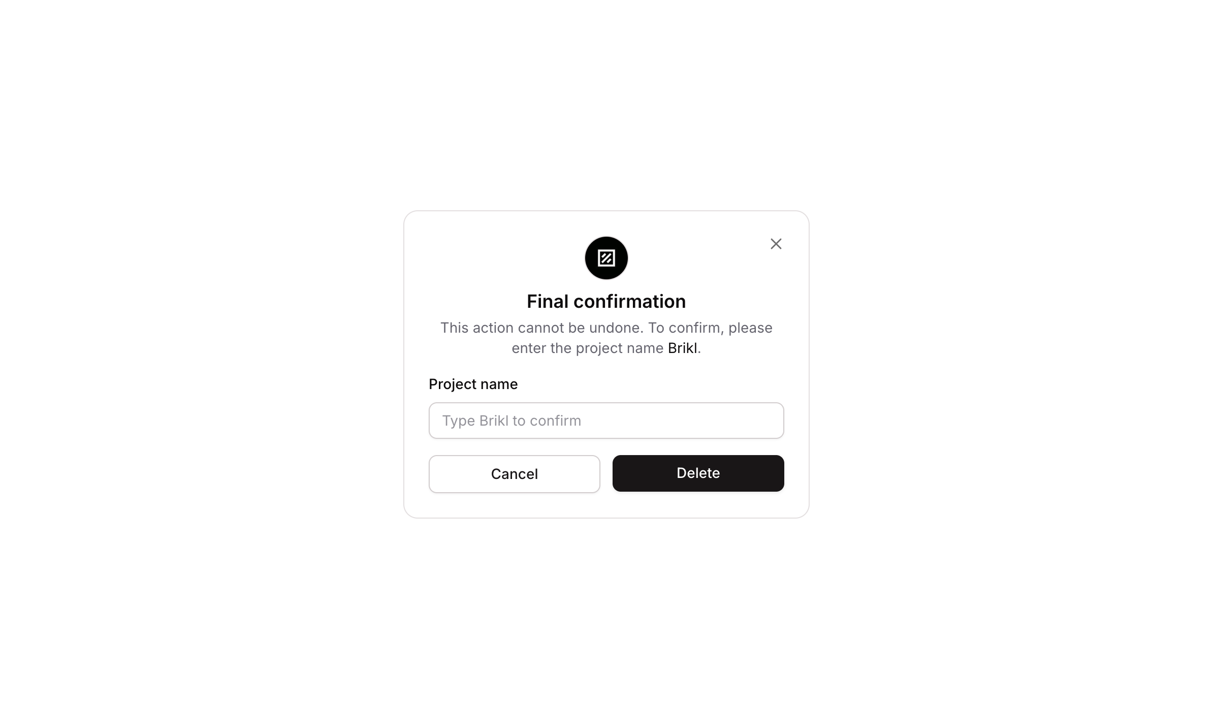
Popup 14 is a final confirmation dialog designed to prevent accidental destructive actions. It prompts the user to type a specific project name (e.g., ‘Brikl’) to confirm an irreversible operation such as deleting a project. It includes a branded icon, a title, a descriptive message, a validated text input, and Cancel/Confirm action buttons with hover and focus states.
How to use
Open the Brikl panel
Navigate to the Elements category in the Brikl panel.
Copy the component
Find Popup 14 and click Copy.
Paste into your editor
Paste it into your Bubble canvas with Cmd + V (Mac) or Ctrl + V (Windows),
or right-click on the canvas and select Paste.
States
This component includes conditional states that automatically change its appearance.
| State | Trigger | Visual effect |
|---|
| Input Focused | User clicks or focuses on the project name input field | Input field displays a soft box shadow to indicate active focus |
| Input Invalid | Input value does not pass validation | Input border turns red and a red-tinted box shadow appears |
| Input Disabled | Input is not clickable | Input opacity is reduced to 50% |
| Cancel Button Hovered | User hovers over the Cancel button | Cancel button background changes to a light gray color |
| Cancel Button Disabled | Cancel button is not clickable | Cancel button opacity is reduced to 50% |
These states are handled natively by Bubble and require no additional setup.
They will work automatically once the component is pasted into your editor.
Responsive
This component adapts to mobile screens. Font sizes and layout automatically adjust on screens smaller than Bubble’s built-in mobile breakpoint.
Workflows
This component includes pre-built workflows.
| Trigger | Action |
|---|
| Cancel button (BT - Cancel) clicked | Hides Popup 14 |
| Secondary dismiss button (BT - Close/secondary) clicked | Hides Popup 14 |
| Trigger button (BT - Open Popup) clicked | Shows Popup 14 |
These workflows are included when you use the Copy with Workflows option in the Brikl panel.
Requirements
| |
|---|
| License | Starter plan required |
| Plugins | None |
| Custom code | Not required |
| Platform | Supported |
|---|
| Web | ✅ |
| Mobile | ❌ |
License
This component requires a Starter plan.