Overview
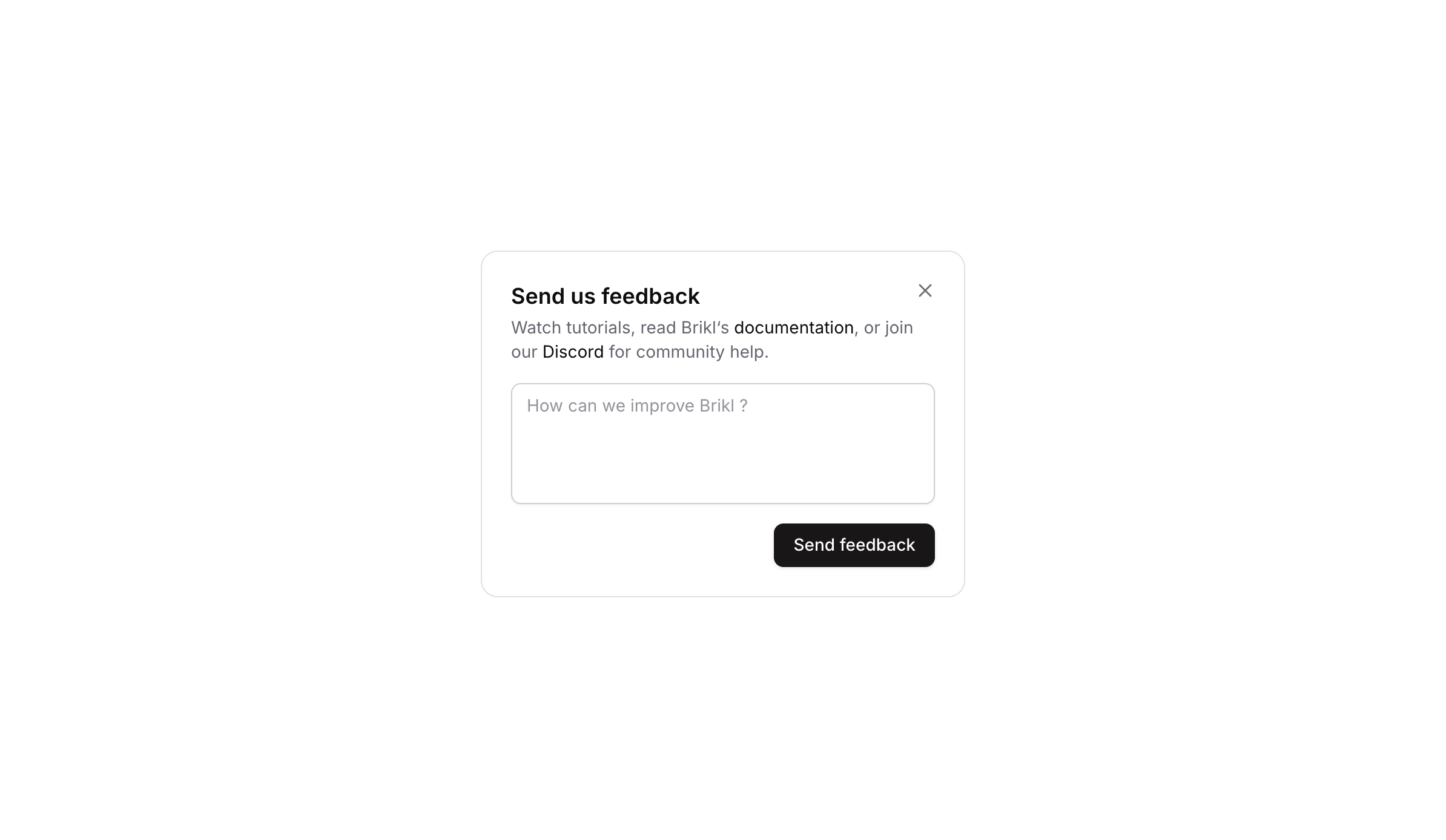
Popup 10 is a feedback collection modal that presents users with a title, a brief description with documentation links, a multiline text input, and a ‘Send feedback’ submit button. It includes a close icon to dismiss the popup and is triggered by an external button element.
How to use
Open the Brikl panel
Navigate to the Elements category in the Brikl panel.
Copy the component
Find Popup 10 and click Copy.
Paste into your editor
Paste it into your Bubble canvas with Cmd + V (Mac) or Ctrl + V (Windows),
or right-click on the canvas and select Paste.
States
This component includes conditional states that automatically change its appearance.
| State | Trigger | Visual effect |
|---|
| Button Hovered | User hovers over the ‘Send feedback’ button | Button opacity reduces to 90% |
| Button Disabled | Button is not clickable | Button opacity reduces to 50% |
| Textarea Focused | User clicks/focuses on the multiline input | A soft box shadow appears around the textarea border |
| Textarea Invalid | Input fails validation | Border turns red and a red-tinted box shadow appears |
| Textarea Disabled | Textarea is not clickable | Textarea opacity reduces to 50% |
| Close Icon Hovered | User hovers over the close icon | Close icon opacity increases to 100% |
These states are handled natively by Bubble and require no additional setup.
They will work automatically once the component is pasted into your editor.
Responsive
This component adapts to mobile screens. Font sizes and layout automatically adjust on screens smaller than Bubble’s built-in mobile breakpoint.
Workflows
This component includes pre-built workflows.
| Trigger | Action |
|---|
| Close icon (Icon - Close) is clicked | Hides the Popup 10 element |
| Trigger button (external element bTURt) is clicked | Shows the Popup 10 element |
These workflows are included when you use the Copy with Workflows option in the Brikl panel.
Requirements
| |
|---|
| License | Starter plan required |
| Plugins | None |
| Custom code | Not required |
| Platform | Supported |
|---|
| Web | ✅ |
| Mobile | ❌ |
License
This component requires a Starter plan.