Overview
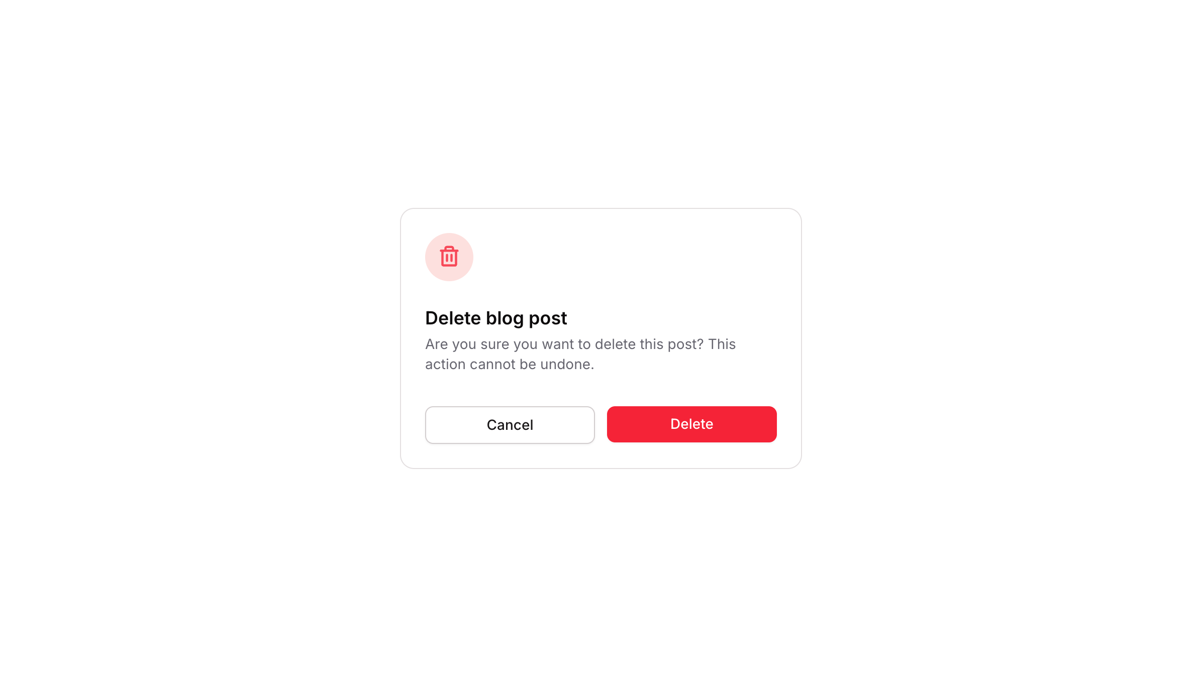
Popup 05 is a delete confirmation dialog component. It presents users with a warning icon, a title, and a descriptive message asking them to confirm a destructive action. It includes a Cancel button to dismiss the popup and a red Delete button to proceed. The component is designed for web applications and handles show/hide workflows to control its visibility.
How to use
Open the Brikl panel
Navigate to the Elements category in the Brikl panel.
Copy the component
Find Popup 05 and click Copy.
Paste into your editor
Paste it into your Bubble canvas with Cmd + V (Mac) or Ctrl + V (Windows),
or right-click on the canvas and select Paste.
States
This component includes conditional states that automatically change its appearance.
| State | Trigger | Visual effect |
|---|
| Cancel Button Hovered | User hovers over the Cancel button | Background color changes to rgba(245, 244, 244, 1) |
| Cancel Button Disabled | Cancel button is not clickable | Opacity reduces to 50% |
| Delete Button Hovered | User hovers over the Delete button | Opacity reduces to 90% |
| Delete Button Disabled | Delete button is not clickable | Opacity reduces to 50% |
These states are handled natively by Bubble and require no additional setup.
They will work automatically once the component is pasted into your editor.
Responsive
This component adapts to mobile screens. Font sizes and layout automatically adjust on screens smaller than Bubble’s built-in mobile breakpoint.
Workflows
This component includes pre-built workflows.
| Trigger | Action |
|---|
| BT - Cancel (Popup 05) clicked | Hides the Popup 05 element |
| External trigger button (bTUIx) clicked | Shows the Popup 05 element |
These workflows are included when you use the Copy with Workflows option in the Brikl panel.
Requirements
| |
|---|
| License | Starter plan required |
| Plugins | None |
| Custom code | Not required |
| Platform | Supported |
|---|
| Web | ✅ |
| Mobile | ❌ |
License
This component requires a Starter plan.