Overview
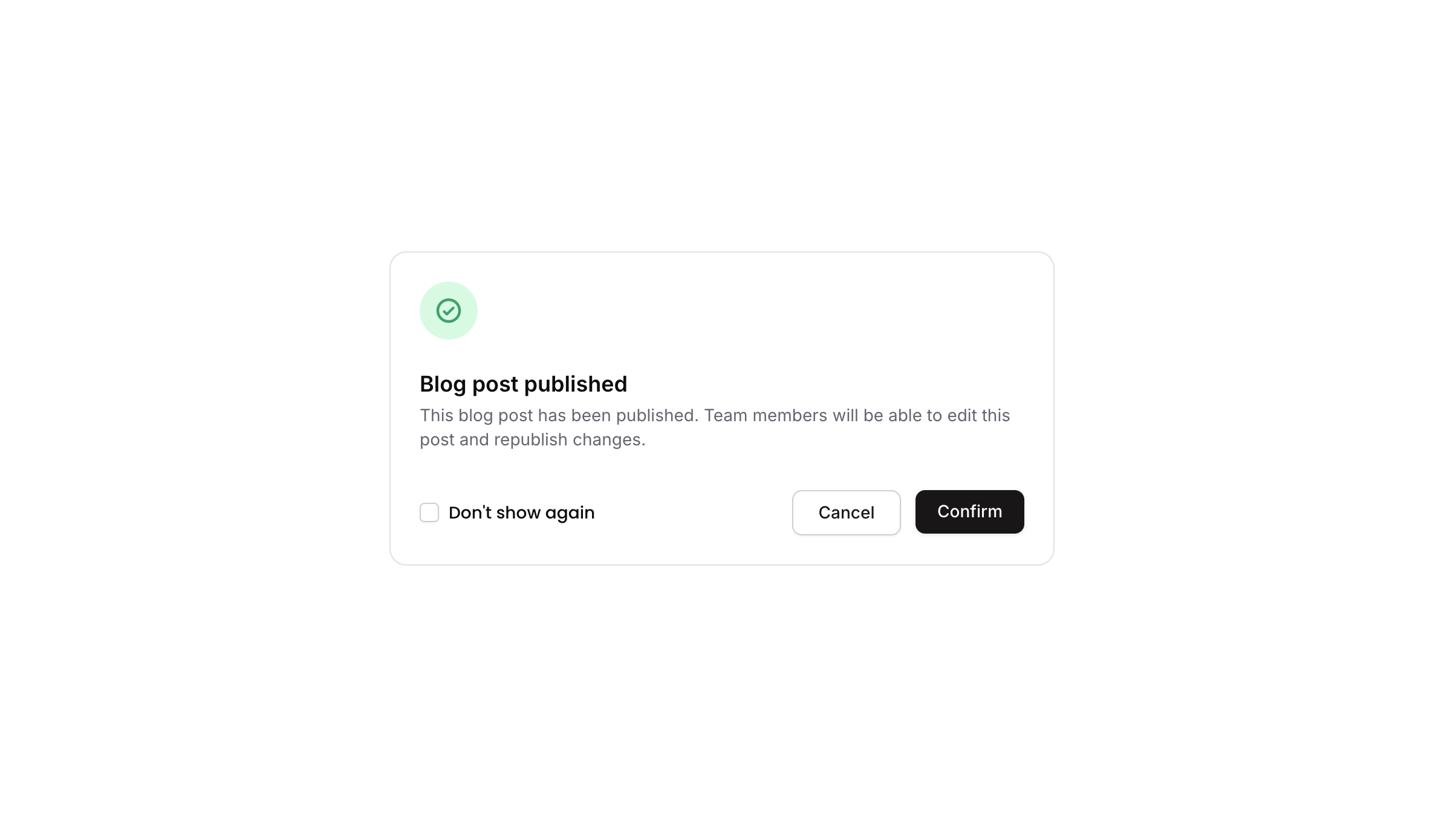
Popup 06 is a confirmation modal dialog that displays a success-style notification with a green check icon, a title, a descriptive message, a ‘Don’t show again’ checkbox toggle, and two action buttons (Cancel and Confirm). It is designed to inform users of a completed action and allow them to confirm or dismiss, with an optional preference to suppress future appearances.
How to use
Open the Brikl panel
Navigate to the Elements category in the Brikl panel.
Copy the component
Find Popup 06 and click Copy.
Paste into your editor
Paste it into your Bubble canvas with Cmd + V (Mac) or Ctrl + V (Windows),
or right-click on the canvas and select Paste.
States
This component includes conditional states that automatically change its appearance.
| State | Trigger | Visual effect |
|---|
| Cancel Button Hovered | User hovers over the Cancel button | Cancel button background changes to rgba(245, 244, 244, 1) |
| Cancel Button Disabled | Cancel button is not clickable | Cancel button opacity reduces to 50% |
| Confirm Button Hovered | User hovers over the Confirm button | Confirm button opacity reduces to 90% |
| Confirm Button Disabled | Confirm button is not clickable | Confirm button opacity reduces to 50% |
| Checkbox Checked | custom.show_again_ state is false on the popup element | Checkbox icon changes to a filled checkmark with dark background (rgba(11,8,9,1)) |
| Mobile Responsive Text | Current page width is less than mobile breakpoint | Text elements reduce font size to 14px |
These states are handled natively by Bubble and require no additional setup.
They will work automatically once the component is pasted into your editor.
Responsive
This component adapts to mobile screens. Font sizes and layout automatically adjust on screens smaller than Bubble’s built-in mobile breakpoint.
Workflows
This component includes pre-built workflows.
| Trigger | Action |
|---|
| Cancel button (BT - Cancel) is clicked | Hides the popup element (Popup 06) |
| Checkbox (Checkbox - Don’t Show Again) is clicked when custom.show_again_ is true | Sets custom state custom.show_again_ to false on the popup element |
| Checkbox (Checkbox - Don’t Show Again) is clicked when custom.show_again_ is false | Sets custom state custom.show_again_ to true on the popup element |
| A separate trigger button (element bTULN) is clicked | Shows the popup element (Popup 06) |
These workflows are included when you use the Copy with Workflows option in the Brikl panel.
Requirements
| |
|---|
| License | Starter plan required |
| Plugins | None |
| Custom code | Not required |
| Platform | Supported |
|---|
| Web | ✅ |
| Mobile | ❌ |
License
This component requires a Starter plan.