Overview
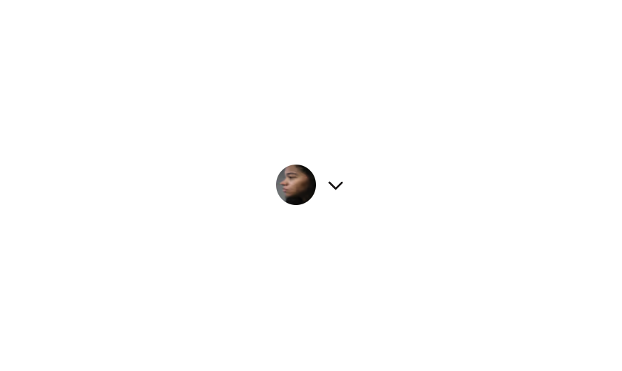
Button 12 is a compact interactive button component featuring a circular user avatar image alongside a downward-pointing caret icon. It is designed to serve as a profile or account menu trigger, commonly used in navigation bars or headers to open dropdown menus. The horizontal row layout with centered alignment makes it intuitive for users to interact with.
How to use
Open the Brikl panel
Navigate to the Elements category in the Brikl panel.
Copy the component
Find Button 12 and click Copy.
Paste into your editor
Paste it into your Bubble canvas with Cmd + V (Mac) or Ctrl + V (Windows),
or right-click on the canvas and select Paste.
Responsive
This component adapts to mobile screens. Font sizes and layout automatically adjust on screens smaller than Bubble’s built-in mobile breakpoint.
Requirements
| |
|---|
| License | Starter plan required |
| Plugins | None |
| Custom code | Not required |
| Platform | Supported |
|---|
| Web | ✅ |
| Mobile | ✅ |
License
This component requires a Starter plan.