Overview
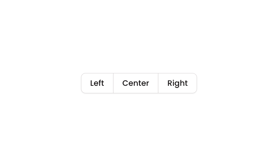
Button 16 is a segmented button group component containing three connected buttons labeled Left, Center, and Right. It is designed to function as a button group with visually joined borders, where the leftmost button has rounded left corners, the center button has no rounded corners, and the rightmost button has rounded right corners. This component is ideal for toggle selections, tab-like navigation, or grouped action controls in both web and mobile interfaces.How to use
1
Open the Brikl panel
Navigate to the Elements category in the Brikl panel.
2
Copy the component
Find Button 16 and click Copy.
3
Paste into your editor
Paste it into your Bubble canvas with
Cmd + V (Mac) or Ctrl + V (Windows),
or right-click on the canvas and select Paste.States
This component includes conditional states that automatically change its appearance.These states are handled natively by Bubble and require no additional setup.
They will work automatically once the component is pasted into your editor.
Responsive
This component adapts to mobile screens. Font sizes and layout automatically adjust on screens smaller than Bubble’s built-in mobile breakpoint.Requirements
Platforms
License
This component requires a Starter plan.