Overview
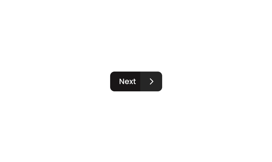
Button 26 is a split-button component combining two visually connected buttons: a primary dark ‘Next’ button on the left and a secondary icon button (caret-right) on the right. Together they form a unified pill-style control, commonly used for navigation or multi-action scenarios where a primary action and a related secondary action (e.g., proceeding to next step or accessing files) are grouped together.How to use
1
Open the Brikl panel
Navigate to the Elements category in the Brikl panel.
2
Copy the component
Find Button 26 and click Copy.
3
Paste into your editor
Paste it into your Bubble canvas with
Cmd + V (Mac) or Ctrl + V (Windows),
or right-click on the canvas and select Paste.States
This component includes conditional states that automatically change its appearance.These states are handled natively by Bubble and require no additional setup.
They will work automatically once the component is pasted into your editor.
Responsive
This component adapts to mobile screens. Font sizes and layout automatically adjust on screens smaller than Bubble’s built-in mobile breakpoint.Requirements
Platforms
License
This component requires a Starter plan.