Overview
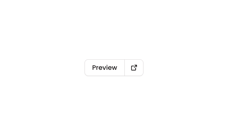
Button 23 is a segmented button component consisting of two visually connected buttons — a ‘Preview’ label button and a ‘Settings’ icon button — styled to appear as a unified control group. The left button displays text with an icon, while the right button shows only an icon. They share a common border style but have mirrored border-radius values to create a joined appearance. This component is ideal for toolbars, editor interfaces, or any UI where paired actions need to be presented as a cohesive control.How to use
1
Open the Brikl panel
Navigate to the Elements category in the Brikl panel.
2
Copy the component
Find Button 23 and click Copy.
3
Paste into your editor
Paste it into your Bubble canvas with
Cmd + V (Mac) or Ctrl + V (Windows),
or right-click on the canvas and select Paste.States
This component includes conditional states that automatically change its appearance.These states are handled natively by Bubble and require no additional setup.
They will work automatically once the component is pasted into your editor.
Responsive
This component adapts to mobile screens. Font sizes and layout automatically adjust on screens smaller than Bubble’s built-in mobile breakpoint.Requirements
Platforms
License
This component requires a Starter plan.