Overview
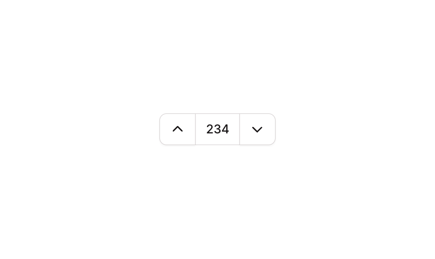
Button 19 is a numeric counter/stepper component featuring two icon buttons (up and down carets) surrounding a disabled numeric input field. It is designed to allow users to increment or decrement a count value, commonly used in quantity selectors, order forms, or any UI requiring numeric input control. The input displays the current count value and is styled to blend seamlessly between the two flanking buttons.How to use
1
Open the Brikl panel
Navigate to the Elements category in the Brikl panel.
2
Copy the component
Find Button 19 and click Copy.
3
Paste into your editor
Paste it into your Bubble canvas with
Cmd + V (Mac) or Ctrl + V (Windows),
or right-click on the canvas and select Paste.States
This component includes conditional states that automatically change its appearance.These states are handled natively by Bubble and require no additional setup.
They will work automatically once the component is pasted into your editor.
Responsive
This component adapts to mobile screens. Font sizes and layout automatically adjust on screens smaller than Bubble’s built-in mobile breakpoint.Requirements
Platforms
License
This component requires a Starter plan.