Overview
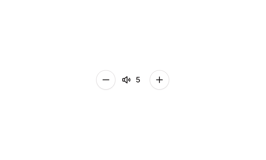
Button 21 is a quantity/volume stepper component featuring two circular icon buttons (minus and plus) flanking a read-only numeric input field with a speaker icon. It is designed for adjusting numeric values such as volume or quantity, with hover and disabled states for interactive feedback.How to use
1
Open the Brikl panel
Navigate to the Elements category in the Brikl panel.
2
Copy the component
Find Button 21 and click Copy.
3
Paste into your editor
Paste it into your Bubble canvas with
Cmd + V (Mac) or Ctrl + V (Windows),
or right-click on the canvas and select Paste.States
This component includes conditional states that automatically change its appearance.These states are handled natively by Bubble and require no additional setup.
They will work automatically once the component is pasted into your editor.
Responsive
This component adapts to mobile screens. Font sizes and layout automatically adjust on screens smaller than Bubble’s built-in mobile breakpoint.Requirements
Platforms
License
This component requires a Starter plan.