Overview
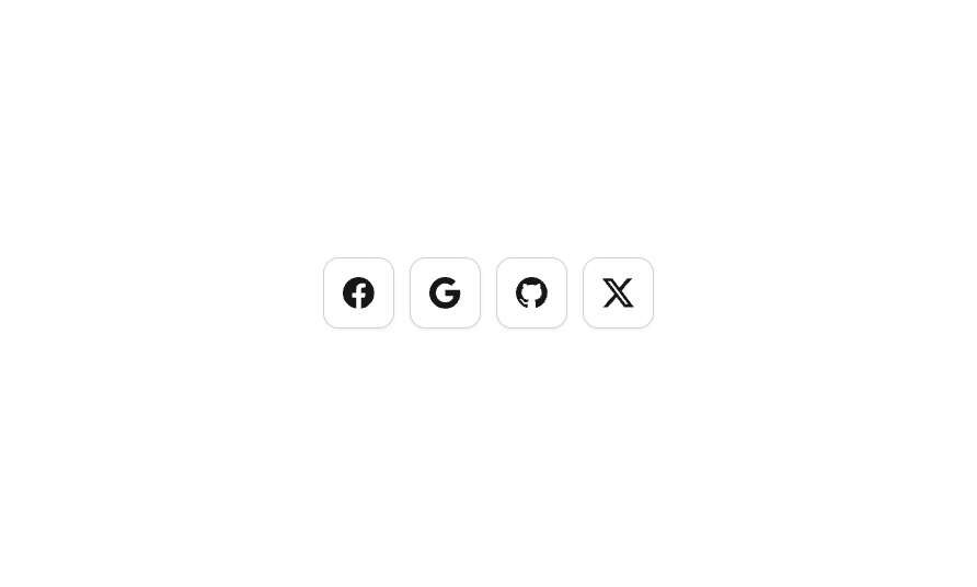
Button 14 is a social icons button group component containing four individual icon-only buttons for Facebook, Google, GitHub, and X (Twitter). Each button features a white background with a subtle border, box shadow, and hover state that transitions to a light gray background. The buttons are arranged in a horizontal row with 8px gaps, making it ideal for social login or social media link sections in web and mobile interfaces.How to use
1
Open the Brikl panel
Navigate to the Elements category in the Brikl panel.
2
Copy the component
Find Button 14 and click Copy.
3
Paste into your editor
Paste it into your Bubble canvas with
Cmd + V (Mac) or Ctrl + V (Windows),
or right-click on the canvas and select Paste.States
This component includes conditional states that automatically change its appearance.These states are handled natively by Bubble and require no additional setup.
They will work automatically once the component is pasted into your editor.
Responsive
This component adapts to mobile screens. Font sizes and layout automatically adjust on screens smaller than Bubble’s built-in mobile breakpoint.Requirements
Platforms
License
This component requires a Starter plan.