Overview
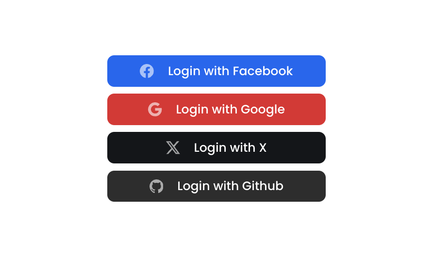
Button 15 is a social authentication button group component containing four styled login buttons for Facebook, Google, X (Twitter), and GitHub. Each button features a brand-specific background color, a Bootstrap icon, and a label, arranged in a vertical column layout. It is designed for login or sign-up flows where users can authenticate via third-party social providers.How to use
1
Open the Brikl panel
Navigate to the Elements category in the Brikl panel.
2
Copy the component
Find Button 15 and click Copy.
3
Paste into your editor
Paste it into your Bubble canvas with
Cmd + V (Mac) or Ctrl + V (Windows),
or right-click on the canvas and select Paste.States
This component includes conditional states that automatically change its appearance.These states are handled natively by Bubble and require no additional setup.
They will work automatically once the component is pasted into your editor.
Responsive
This component adapts to mobile screens. Font sizes and layout automatically adjust on screens smaller than Bubble’s built-in mobile breakpoint.Requirements
Platforms
License
This component requires a Starter plan.