
Overview
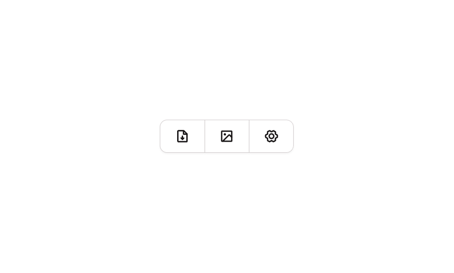
A segmented button group component containing three icon-only buttons arranged horizontally in a row. The buttons represent common actions — Files, Media, and Settings — each using Phosphor Bold icons. The group uses connected border styling where the first button has rounded left corners, the middle button has no rounding, and the last button has rounded right corners, creating a unified toolbar appearance. Suitable for navigation tabs, filter selectors, or action toolbars.How to use
1
Open the Brikl panel
Navigate to the Elements category in the Brikl panel.
2
Copy the component
Find Button 18 and click Copy.
3
Paste into your editor
Paste it into your Bubble canvas with
Cmd + V (Mac) or Ctrl + V (Windows),
or right-click on the canvas and select Paste.States
This component includes conditional states that automatically change its appearance.These states are handled natively by Bubble and require no additional setup.
They will work automatically once the component is pasted into your editor.
Responsive
This component adapts to mobile screens. Font sizes and layout automatically adjust on screens smaller than Bubble’s built-in mobile breakpoint.Requirements
Platforms
License
This component requires a Starter plan.