Overview
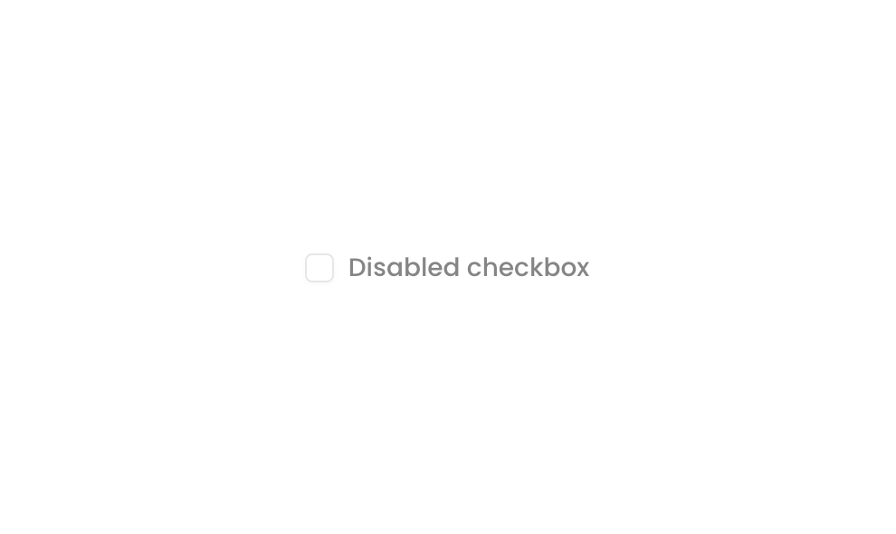
Checkbox 02 is a disabled checkbox UI component designed to represent a non-interactive checkbox state. It consists of a square icon (representing the unchecked state) paired with a ‘Disabled checkbox’ label, arranged horizontally. The component is visually muted at 50% opacity when its non-clickable state is triggered, clearly communicating to users that this option is unavailable for interaction.
How to use
Open the Brikl panel
Navigate to the Elements category in the Brikl panel.
Copy the component
Find Checkbox 02 and click Copy.
Paste into your editor
Paste it into your Bubble canvas with Cmd + V (Mac) or Ctrl + V (Windows),
or right-click on the canvas and select Paste.
States
This component includes conditional states that automatically change its appearance.
| State | Trigger | Visual effect |
|---|
| Disabled State | Element is not clickable (isnt_clickable condition on ThisElement) | The group opacity drops to 50%, visually indicating the checkbox is disabled and non-interactive. |
These states are handled natively by Bubble and require no additional setup.
They will work automatically once the component is pasted into your editor.
Responsive
This component adapts to mobile screens. Font sizes and layout automatically adjust on screens smaller than Bubble’s built-in mobile breakpoint.
Requirements
| |
|---|
| License | Free |
| Plugins | None |
| Custom code | Not required |
| Platform | Supported |
|---|
| Web | ✅ |
| Mobile | ✅ |
License
This component is available on the free plan.