Overview
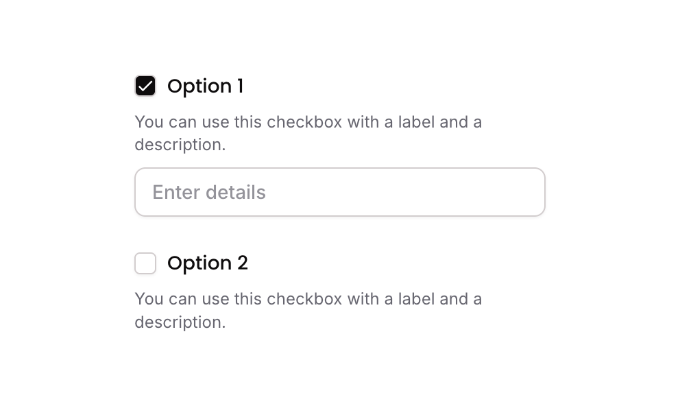
Checkbox 09 is a multi-option checkbox component that supports expansion behavior. When a checkbox option is selected, it reveals an additional text input field for the user to enter supplementary details. It uses custom states to track selected items and conditionally show or hide the expansion input, making it ideal for forms requiring conditional follow-up information.
How to use
Open the Brikl panel
Navigate to the Elements category in the Brikl panel.
Copy the component
Find Checkbox 09 and click Copy.
Paste into your editor
Paste it into your Bubble canvas with Cmd + V (Mac) or Ctrl + V (Windows),
or right-click on the canvas and select Paste.
States
This component includes conditional states that automatically change its appearance.
| State | Trigger | Visual effect |
|---|
| Option Selected | User clicks a checkbox option group | Icon changes from outlined square to filled check with black background; selected item is added to the custom state list |
| Option Deselected | User clicks an already-selected checkbox option group | Icon reverts to outlined square; selected item is removed from the custom state list and the expansion input is hidden |
| Expansion Input Visible | Checkbox option is selected (item not previously in selected list) | Text input field appears below the selected option and receives focus automatically |
| Input Focused | Input element receives focus | Box shadow appears around the input to indicate active focus state |
| Input Invalid | Input fails validation | Border turns red and a red-tinted box shadow appears around the input |
| Input Disabled | Input is not clickable | Input opacity reduces to 50% |
| Mobile Responsive | Current page width is less than built-in mobile breakpoint | Font size of label and description text increases to 14px |
These states are handled natively by Bubble and require no additional setup.
They will work automatically once the component is pasted into your editor.
Responsive
This component adapts to mobile screens. Font sizes and layout automatically adjust on screens smaller than Bubble’s built-in mobile breakpoint.
Workflows
This component includes pre-built workflows.
| Trigger | Action |
|---|
| Group - Option 01 is clicked (when item NOT already selected) | Adds the option’s item number to the parent group’s custom state selected_item_ list, shows the expansion input, and sets focus to it |
| Group - Option 01 is clicked (when item IS already selected) | Removes the option’s item number from the parent group’s custom state selected_item_ list and hides the expansion input |
| Group - Option 02 is clicked (when item NOT already selected) | Adds the option’s item number to the parent group’s custom state selected_item_ list and shows the expansion input |
| Group - Option 02 is clicked (when item IS already selected) | Removes the option’s item number from the parent group’s custom state selected_item_ list and hides the expansion input |
These workflows are included when you use the Copy with Workflows option in the Brikl panel.
Requirements
| |
|---|
| License | Starter plan required |
| Plugins | None |
| Custom code | Not required |
| Platform | Supported |
|---|
| Web | ✅ |
| Mobile | ✅ |
License
This component requires a Starter plan.