Overview
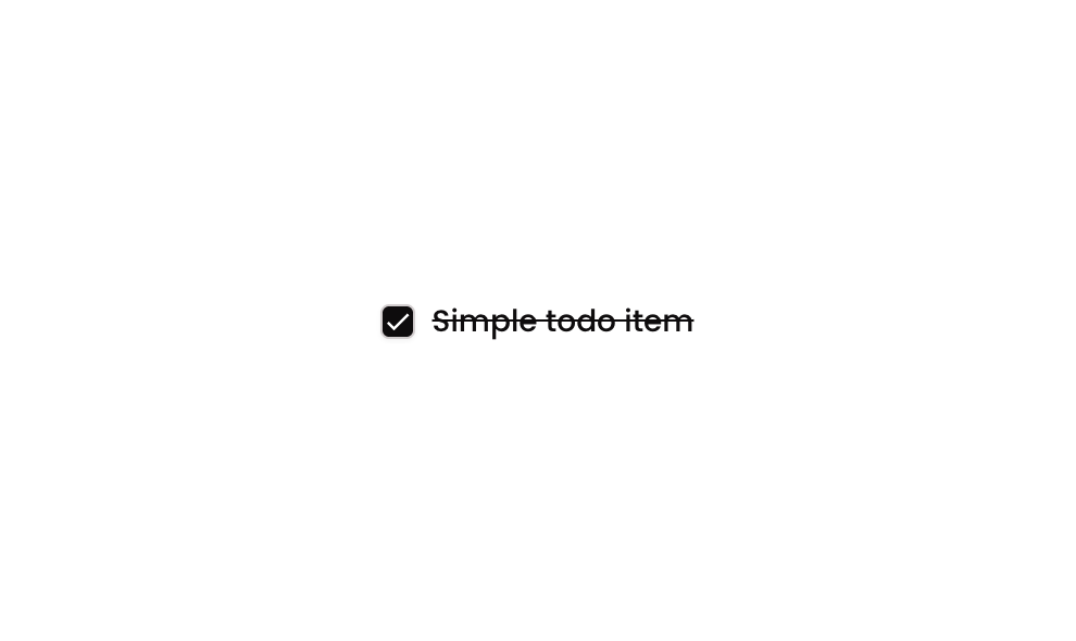
Checkbox 03 is a interactive checkbox component that displays a square icon alongside a text label. When clicked, it toggles a custom ‘selected’ state, changing the icon to a checkmark and applying a strikethrough style to the label text, mimicking a to-do item completion interaction.
How to use
Open the Brikl panel
Navigate to the Elements category in the Brikl panel.
Copy the component
Find Checkbox 03 and click Copy.
Paste into your editor
Paste it into your Bubble canvas with Cmd + V (Mac) or Ctrl + V (Windows),
or right-click on the canvas and select Paste.
States
This component includes conditional states that automatically change its appearance.
| State | Trigger | Visual effect |
|---|
| Selected | User clicks the group when ‘selected_’ custom state is false | Icon changes from an empty square to a filled checkmark, and the label text renders with strikethrough formatting |
| Unselected | User clicks the group when ‘selected_’ custom state is true | Icon reverts to an empty square and the label text displays normally without strikethrough |
These states are handled natively by Bubble and require no additional setup.
They will work automatically once the component is pasted into your editor.
Responsive
This component adapts to mobile screens. Font sizes and layout automatically adjust on screens smaller than Bubble’s built-in mobile breakpoint.
Workflows
This component includes pre-built workflows.
| Trigger | Action |
|---|
| Group ‘Checkbox W/ Strikethrough Text (Checkbox 03)’ is clicked (when selected_ is false) | Sets the custom state ‘selected_’ to true on the group element |
| Group ‘Checkbox W/ Strikethrough Text (Checkbox 03)’ is clicked (when selected_ is true) | Sets the custom state ‘selected_’ to false on the group element |
These workflows are included when you use the Copy with Workflows option in the Brikl panel.
Requirements
| |
|---|
| License | Free |
| Plugins | None |
| Custom code | Not required |
| Platform | Supported |
|---|
| Web | ✅ |
| Mobile | ✅ |
License
This component is available on the free plan.