Overview
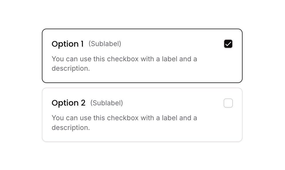
Checkbox 10 is a styled checkbox component featuring multiple selectable options, each displayed as a bordered card containing a checkbox icon, a title, a sublabel, and a description. It uses custom states to track which options are selected, toggling border styles and icon fills to reflect selection. Designed for both web and mobile, it supports responsive font sizing and is suitable for multi-select form inputs.
How to use
Open the Brikl panel
Navigate to the Elements category in the Brikl panel.
Copy the component
Find Checkbox 10 and click Copy.
Paste into your editor
Paste it into your Bubble canvas with Cmd + V (Mac) or Ctrl + V (Windows),
or right-click on the canvas and select Paste.
States
This component includes conditional states that automatically change its appearance.
| State | Trigger | Visual effect |
|---|
| Selected Option | User clicks a checkbox option group that is not yet selected | The option card border color changes to dark (rgba(27,23,24,1)) and the checkbox icon fills with a dark background and a check mark |
| Deselected Option | User clicks a checkbox option group that is already selected | The option card reverts to its default border style and the checkbox icon returns to an empty unchecked appearance |
| Mobile Responsive | Current page width is less than the built-in mobile breakpoint | Font size of labels and descriptions increases to 14px for better mobile readability |
These states are handled natively by Bubble and require no additional setup.
They will work automatically once the component is pasted into your editor.
Responsive
This component adapts to mobile screens. Font sizes and layout automatically adjust on screens smaller than Bubble’s built-in mobile breakpoint.
Workflows
This component includes pre-built workflows.
| Trigger | Action |
|---|
| Group - Checkbox Option 01 is clicked (condition: option 01 is NOT in selected list) | Adds Option 01’s item value to the parent group’s custom state ‘selected_item_’ list |
| Group - Checkbox Option 01 is clicked (condition: option 01 IS in selected list) | Removes Option 01’s item value from the parent group’s custom state ‘selected_item_’ list |
| Group - Checkbox Option 02 is clicked (condition: option 02 is NOT in selected list) | Adds Option 02’s item value to the parent group’s custom state ‘selected_item_’ list |
| Group - Checkbox Option 02 is clicked (condition: option 02 IS in selected list) | Removes Option 02’s item value from the parent group’s custom state ‘selected_item_’ list |
These workflows are included when you use the Copy with Workflows option in the Brikl panel.
Requirements
| |
|---|
| License | Starter plan required |
| Plugins | None |
| Custom code | Not required |
| Platform | Supported |
|---|
| Web | ✅ |
| Mobile | ✅ |
License
This component requires a Starter plan.