Overview
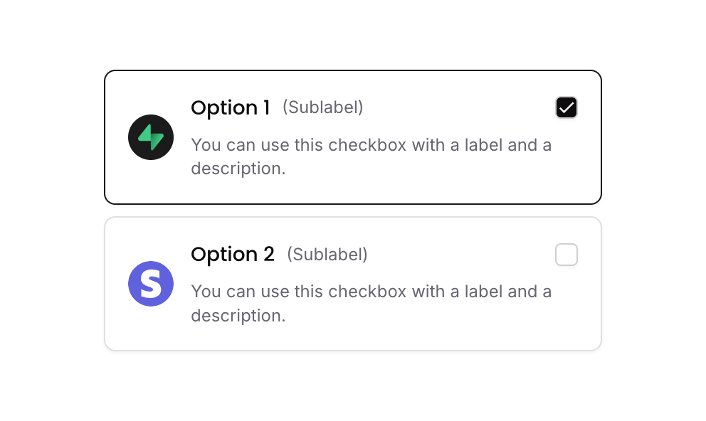
Checkbox 11 is a multi-select checkbox component built as a group of styled card options. Each option includes a logo image, a title, a sublabel, a description text, and a visual checkbox icon. Selections are tracked via a custom state (selected_item_) on the parent group, allowing multiple items to be toggled on or off. The component is suitable for product selection, plan picking, or any multi-choice UI requiring rich card-style options.
How to use
Open the Brikl panel
Navigate to the Elements category in the Brikl panel.
Copy the component
Find Checkbox 11 and click Copy.
Paste into your editor
Paste it into your Bubble canvas with Cmd + V (Mac) or Ctrl + V (Windows),
or right-click on the canvas and select Paste.
States
This component includes conditional states that automatically change its appearance.
| State | Trigger | Visual effect |
|---|
| Selected | User clicks a checkbox option group | Border color changes to solid dark (rgba(27,23,24,1)) and the checkbox icon fills with a dark background and a checkmark icon |
| Unselected | User clicks an already selected checkbox option group | Border reverts to default light style and checkbox icon returns to empty square appearance |
| Mobile font size | Current page width is less than the built-in mobile breakpoint | Font size of label and sublabel text increases to 14px |
These states are handled natively by Bubble and require no additional setup.
They will work automatically once the component is pasted into your editor.
Responsive
This component adapts to mobile screens. Font sizes and layout automatically adjust on screens smaller than Bubble’s built-in mobile breakpoint.
Workflows
This component includes pre-built workflows.
| Trigger | Action |
|---|
| Group - Checkbox Option 01 is clicked (condition: item not in selected list) | Adds the option’s custom item_ value to the selected_item_ list state on the parent group |
| Group - Checkbox Option 01 is clicked (condition: item already in selected list) | Removes the option’s custom item_ value from the selected_item_ list state on the parent group |
| Group - Checkbox Option 02 is clicked (condition: item not in selected list) | Adds the option’s custom item_ value to the selected_item_ list state on the parent group |
| Group - Checkbox Option 02 is clicked (condition: item already in selected list) | Removes the option’s custom item_ value from the selected_item_ list state on the parent group |
These workflows are included when you use the Copy with Workflows option in the Brikl panel.
Requirements
| |
|---|
| License | Starter plan required |
| Plugins | None |
| Custom code | Not required |
| Platform | Supported |
|---|
| Web | ✅ |
| Mobile | ✅ |
License
This component requires a Starter plan.