Overview
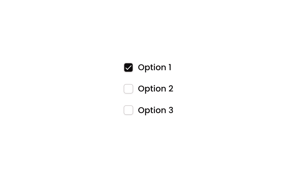
Checkbox 06 is a multiple-selection checkbox component displaying options in a multi-column layout. Each option consists of a square icon (acting as a checkbox indicator) and a text label. The component tracks selected items using a custom state list on the parent group, toggling items in or out of the selection when clicked. It is suitable for forms, filters, or preference selections where multiple choices are allowed simultaneously.
How to use
Open the Brikl panel
Navigate to the Elements category in the Brikl panel.
Copy the component
Find Checkbox 06 and click Copy.
Paste into your editor
Paste it into your Bubble canvas with Cmd + V (Mac) or Ctrl + V (Windows),
or right-click on the canvas and select Paste.
States
This component includes conditional states that automatically change its appearance.
| State | Trigger | Visual effect |
|---|
| Checked | User clicks an option group whose item value is not yet in the selected_item_ custom state list | The icon switches to a filled check icon with a dark background (rgba(11,8,9,1)), indicating the option is selected |
| Unchecked | User clicks an option group whose item value is already in the selected_item_ custom state list | The icon reverts to an outlined square icon with no fill, indicating the option is deselected |
| Mobile font size | Current page width is less than the built-in mobile breakpoint | Option label text font size reduces to 14px for better readability on small screens |
These states are handled natively by Bubble and require no additional setup.
They will work automatically once the component is pasted into your editor.
Responsive
This component adapts to mobile screens. Font sizes and layout automatically adjust on screens smaller than Bubble’s built-in mobile breakpoint.
Workflows
This component includes pre-built workflows.
| Trigger | Action |
|---|
| Group - Option 1 clicked (when item is NOT in selected list) | Adds the option’s item_ value to the selected_item_ custom state list on the parent group |
| Group - Option 1 clicked (when item IS in selected list) | Removes the option’s item_ value from the selected_item_ custom state list on the parent group |
| Group - Option 2 clicked (when item is NOT in selected list) | Adds the option’s item_ value to the selected_item_ custom state list on the parent group |
| Group - Option 2 clicked (when item IS in selected list) | Removes the option’s item_ value from the selected_item_ custom state list on the parent group |
| Group - Option 3 clicked (when item is NOT in selected list) | Adds the option’s item_ value to the selected_item_ custom state list on the parent group |
| Group - Option 3 clicked (when item IS in selected list) | Removes the option’s item_ value from the selected_item_ custom state list on the parent group |
These workflows are included when you use the Copy with Workflows option in the Brikl panel.
Requirements
| |
|---|
| License | Starter plan required |
| Plugins | None |
| Custom code | Not required |
| Platform | Supported |
|---|
| Web | ✅ |
| Mobile | ✅ |
License
This component requires a Starter plan.