Overview
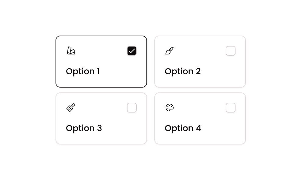
Checkbox 12 is a multi-select checkbox component featuring two styled card-based options, each containing an icon and a label. Users can toggle options on and off, with visual feedback provided through border and icon changes. The component uses custom states to track selected items and supports both web and mobile layouts.
How to use
Open the Brikl panel
Navigate to the Elements category in the Brikl panel.
Copy the component
Find Checkbox 12 and click Copy.
Paste into your editor
Paste it into your Bubble canvas with Cmd + V (Mac) or Ctrl + V (Windows),
or right-click on the canvas and select Paste.
States
This component includes conditional states that automatically change its appearance.
| State | Trigger | Visual effect |
|---|
| Option Selected | When the option’s item value is contained in the parent group’s selected_item_ custom state list | The card border changes to a dark color (rgba(27,23,24,1)) and the checkbox icon switches to a filled check mark with a dark background |
| Option Unselected | Default state when the item is not in the selected_item_ list | The card displays a light border and the checkbox icon shows an empty square with a white background |
| Mobile Responsive | Current page width is less than the built-in mobile breakpoint | Text font size reduces to 14px for better fit on smaller screens |
These states are handled natively by Bubble and require no additional setup.
They will work automatically once the component is pasted into your editor.
Responsive
This component adapts to mobile screens. Font sizes and layout automatically adjust on screens smaller than Bubble’s built-in mobile breakpoint.
Workflows
This component includes pre-built workflows.
| Trigger | Action |
|---|
| Group - Checkbox Option 01 is clicked (condition: item NOT in selected list) | Adds Option 01’s item value to the selected_item_ custom state list on the parent group |
| Group - Checkbox Option 01 is clicked (condition: item already in selected list) | Removes Option 01’s item value from the selected_item_ custom state list on the parent group |
| Group - Checkbox Option 02 is clicked (condition: item NOT in selected list) | Adds Option 02’s item value to the selected_item_ custom state list on the parent group |
| Group - Checkbox Option 02 is clicked (condition: item already in selected list) | Removes Option 02’s item value from the selected_item_ custom state list on the parent group |
These workflows are included when you use the Copy with Workflows option in the Brikl panel.
Requirements
| |
|---|
| License | Starter plan required |
| Plugins | None |
| Custom code | Not required |
| Platform | Supported |
|---|
| Web | ✅ |
| Mobile | ✅ |
License
This component requires a Starter plan.