Overview
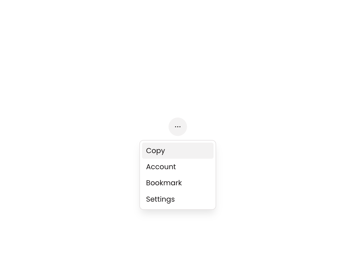
Dropdown 01 is a GroupFocus-based dropdown menu component containing four action buttons (Copy, Account, Bookmark, Settings), each with a Phosphor icon and label. It appears as a floating panel anchored to a reference element, designed to provide contextual navigation or action options when triggered. The component uses column layout, subtle box shadow, and hover/disabled states for interactive feedback.
How to use
Open the Brikl panel
Navigate to the Elements category in the Brikl panel.
Copy the component
Find Dropdown 01 and click Copy.
Paste into your editor
Paste it into your Bubble canvas with Cmd + V (Mac) or Ctrl + V (Windows),
or right-click on the canvas and select Paste.
States
This component includes conditional states that automatically change its appearance.
| State | Trigger | Visual effect |
|---|
| Hovered | Mouse hover over any button | Button background changes to rgba(245,244,244,1) creating a subtle highlight |
| Disabled | Button is not clickable (isnt_clickable condition) | Button opacity reduces to 50%, indicating it is inactive |
These states are handled natively by Bubble and require no additional setup.
They will work automatically once the component is pasted into your editor.
Requirements
| |
|---|
| License | Free |
| Plugins | None |
| Custom code | Not required |
| Platform | Supported |
|---|
| Web | ✅ |
| Mobile | ❌ |
License
This component is available on the free plan.