Overview
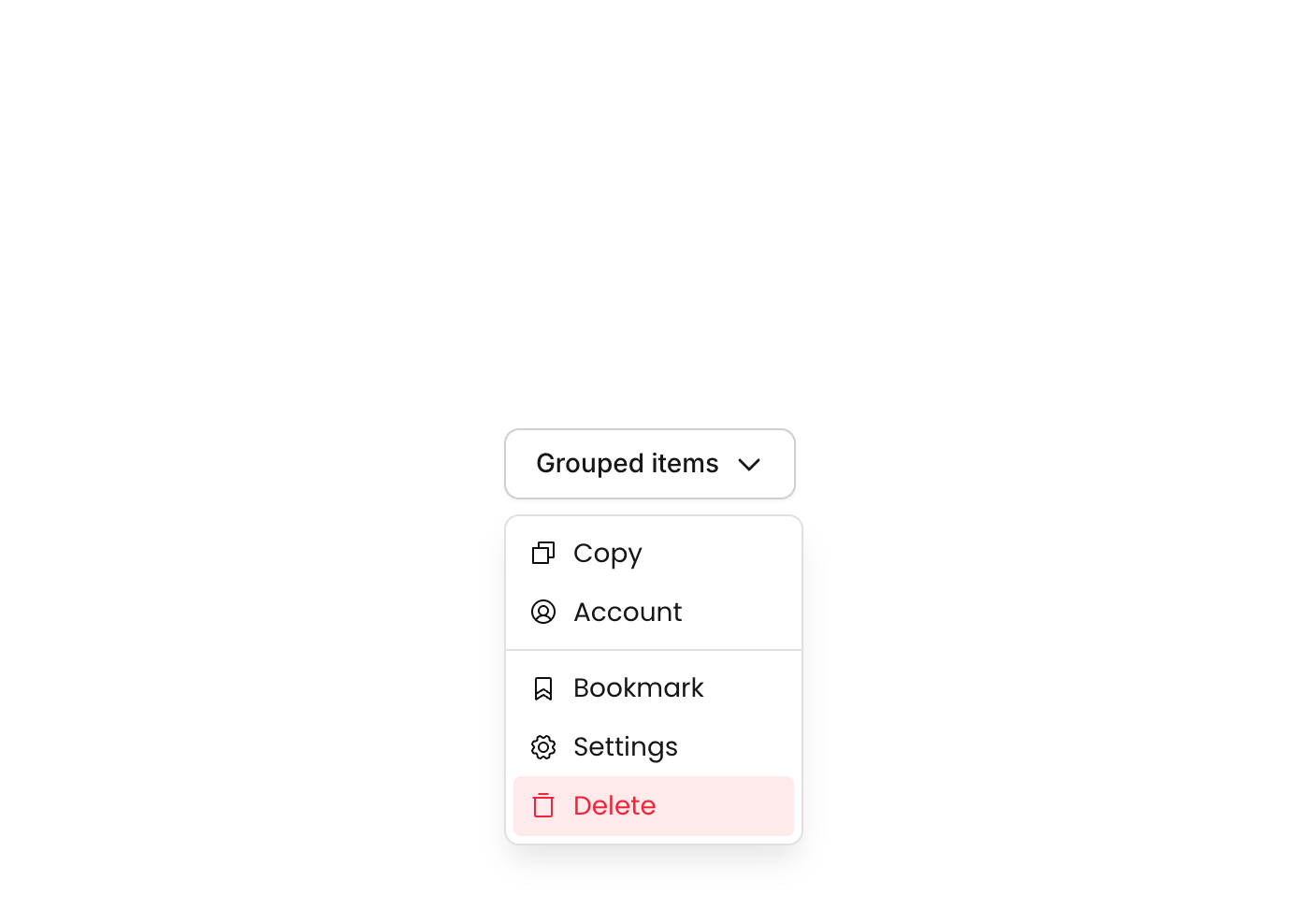
Dropdown 03 is a GroupFocus-based contextual dropdown menu component containing six action buttons (Copy, Account, Bookmark, Settings, Delete) with phosphor icons, a visual divider separator, and a distinct red-styled destructive action. It is designed to appear as a floating panel anchored to a trigger element, providing quick access to common actions with hover state feedback.
How to use
Open the Brikl panel
Navigate to the Elements category in the Brikl panel.
Copy the component
Find Dropdown 03 and click Copy.
Paste into your editor
Paste it into your Bubble canvas with Cmd + V (Mac) or Ctrl + V (Windows),
or right-click on the canvas and select Paste.
States
This component includes conditional states that automatically change its appearance.
| State | Trigger | Visual effect |
|---|
| Hovered | Mouse hover over any action button | Button background changes to rgba(245,244,244,1) light gray; Delete button changes to rgba(251,44,54,0.1) light red tint |
| Disabled | Button is not clickable (isnt_clickable condition) | Button opacity reduces to 50%, indicating a non-interactive state |
These states are handled natively by Bubble and require no additional setup.
They will work automatically once the component is pasted into your editor.
Requirements
| |
|---|
| License | Free |
| Plugins | None |
| Custom code | Not required |
| Platform | Supported |
|---|
| Web | ✅ |
| Mobile | ❌ |
License
This component is available on the free plan.