Overview
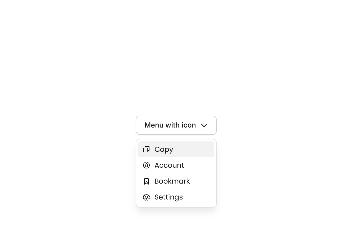
Dropdown 02 is a GroupFocus-based dropdown menu component that displays a compact vertical list of action buttons (Copy, Account, Bookmark, Settings), each paired with a Phosphor icon. It appears as a floating card with a subtle shadow and border, designed to be triggered by a reference element and dismissed on outside click. It is ideal for contextual action menus or user account menus in web applications.
How to use
Open the Brikl panel
Navigate to the Elements category in the Brikl panel.
Copy the component
Find Dropdown 02 and click Copy.
Paste into your editor
Paste it into your Bubble canvas with Cmd + V (Mac) or Ctrl + V (Windows),
or right-click on the canvas and select Paste.
States
This component includes conditional states that automatically change its appearance.
| State | Trigger | Visual effect |
|---|
| Hovered | Mouse hovers over any button | Button background changes to light gray rgba(245,244,244,1) |
| Not Clickable | Button is set to non-interactive/disabled | Button opacity reduces to 50% |
These states are handled natively by Bubble and require no additional setup.
They will work automatically once the component is pasted into your editor.
Responsive
This component adapts to mobile screens. Font sizes and layout automatically adjust on screens smaller than Bubble’s built-in mobile breakpoint.
Requirements
| |
|---|
| License | Free |
| Plugins | None |
| Custom code | Not required |
| Platform | Supported |
|---|
| Web | ✅ |
| Mobile | ❌ |
License
This component is available on the free plan.