Overview
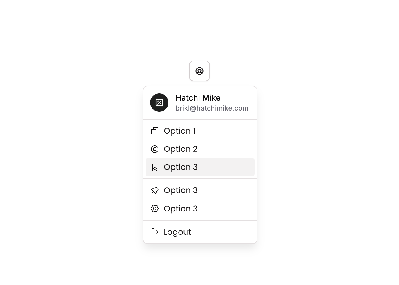
Dropdown 09 is a GroupFocus-based dropdown component that displays a styled menu panel containing a header section with a user avatar image and email, multiple icon-label option buttons (Option 1, Option 2, Option 3), a visual divider, and a Logout button. It is designed for web use as a user account or navigation dropdown, triggered by a parent element click, and collapses automatically when focus is lost.
How to use
Open the Brikl panel
Navigate to the Elements category in the Brikl panel.
Copy the component
Find Dropdown 09 and click Copy.
Paste into your editor
Paste it into your Bubble canvas with Cmd + V (Mac) or Ctrl + V (Windows),
or right-click on the canvas and select Paste.
States
This component includes conditional states that automatically change its appearance.
| State | Trigger | Visual effect |
|---|
| Hovered | Mouse hovers over any button element | Button background changes to rgba(245,244,244,1) with a smooth ease transition of 200ms |
| Not Clickable | Button is in a non-clickable state | Button opacity reduces to 50%, visually indicating it is disabled |
These states are handled natively by Bubble and require no additional setup.
They will work automatically once the component is pasted into your editor.
Requirements
| |
|---|
| License | Starter plan required |
| Plugins | None |
| Custom code | Not required |
| Platform | Supported |
|---|
| Web | ✅ |
| Mobile | ❌ |
License
This component requires a Starter plan.