Overview
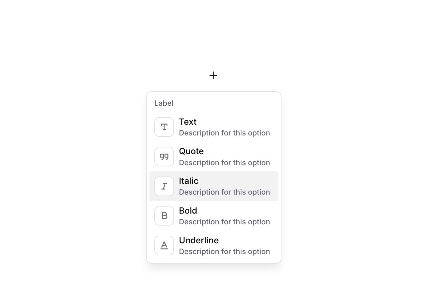
Dropdown 11 is a styled GroupFocus dropdown component displaying multiple selectable options, each consisting of an icon, a primary label, and a secondary description. It is designed for rich dropdown menus where options benefit from visual icons and contextual descriptions, such as formatting pickers or action menus.
How to use
Open the Brikl panel
Navigate to the Elements category in the Brikl panel.
Copy the component
Find Dropdown 11 and click Copy.
Paste into your editor
Paste it into your Bubble canvas with Cmd + V (Mac) or Ctrl + V (Windows),
or right-click on the canvas and select Paste.
States
This component includes conditional states that automatically change its appearance.
| State | Trigger | Visual effect |
|---|
| Hovered Option | Mouse hover over an individual option group (e.g., Group - Option Text, Group - Option Quote, Group - Option Italic) | Background color of the hovered option changes to rgba(245,244,244,1), creating a subtle highlight effect with a 200ms ease transition. |
These states are handled natively by Bubble and require no additional setup.
They will work automatically once the component is pasted into your editor.
Responsive
This component adapts to mobile screens. Font sizes and layout automatically adjust on screens smaller than Bubble’s built-in mobile breakpoint.
Requirements
| |
|---|
| License | Starter plan required |
| Plugins | None |
| Custom code | Not required |
| Platform | Supported |
|---|
| Web | ✅ |
| Mobile | ❌ |
License
This component requires a Starter plan.