Overview
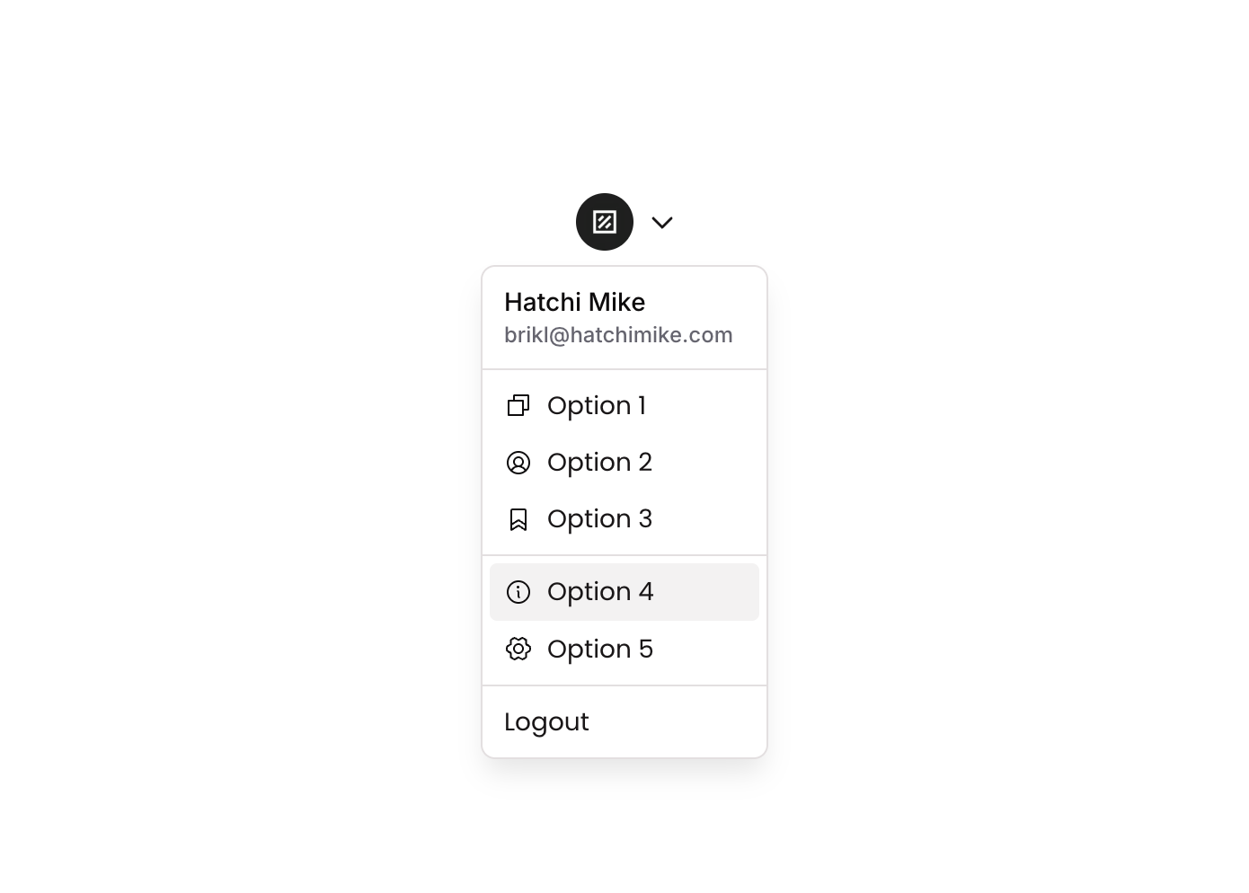
Dropdown 10 is a GroupFocus-based dropdown menu component that displays a user profile header (name and email) followed by a list of clickable options with icons (Option 1, Option 2, Option 3) and a Logout button. It is designed for navigation or account menus, appearing when a trigger element is clicked, with hover states for interactive feedback.
How to use
Open the Brikl panel
Navigate to the Elements category in the Brikl panel.
Copy the component
Find Dropdown 10 and click Copy.
Paste into your editor
Paste it into your Bubble canvas with Cmd + V (Mac) or Ctrl + V (Windows),
or right-click on the canvas and select Paste.
States
This component includes conditional states that automatically change its appearance.
| State | Trigger | Visual effect |
|---|
| Hovered | User hovers over any button option | Button background changes to rgba(245,244,244,1) providing a subtle highlight |
| Not Clickable | Button is set to non-clickable state | Button opacity reduces to 50%, visually indicating it is disabled |
These states are handled natively by Bubble and require no additional setup.
They will work automatically once the component is pasted into your editor.
Requirements
| |
|---|
| License | Starter plan required |
| Plugins | None |
| Custom code | Not required |
| Platform | Supported |
|---|
| Web | ✅ |
| Mobile | ❌ |
License
This component requires a Starter plan.