Overview
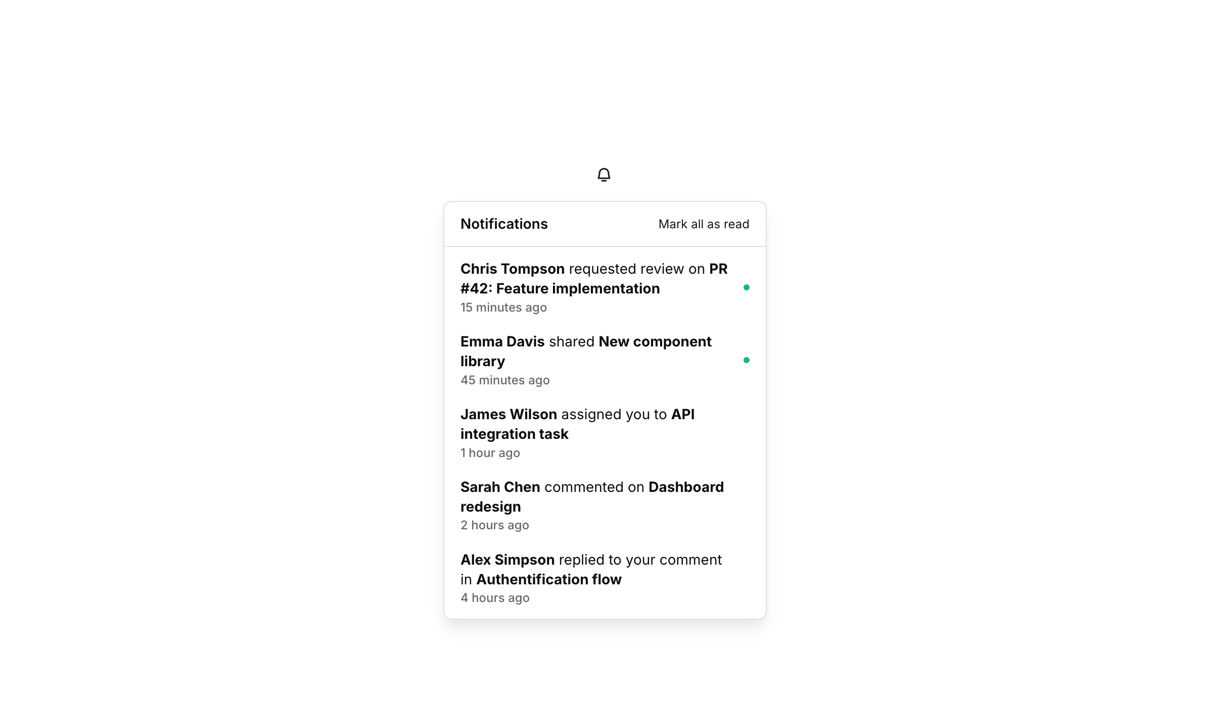
Dropdown 12 is a notifications panel component that appears as a GroupFocus overlay. It displays a header with a ‘Notifications’ title and a ‘Mark all as read’ button, followed by a divider and two notification rows. Each row contains a bold message text with contextual details, a relative timestamp, and a colored status dot indicator. The component is designed for web use and provides a clean, structured way to surface recent user notifications within an application.
How to use
Open the Brikl panel
Navigate to the Elements category in the Brikl panel.
Copy the component
Find Dropdown 12 and click Copy.
Paste into your editor
Paste it into your Bubble canvas with Cmd + V (Mac) or Ctrl + V (Windows),
or right-click on the canvas and select Paste.
States
This component includes conditional states that automatically change its appearance.
| State | Trigger | Visual effect |
|---|
| Notification Row Hovered | User hovers over a notification group (GP - Notification 01 or 02) | Background color changes to rgba(245,244,244,1), providing a subtle highlight effect |
| Mark All As Read - Hovered | User hovers over the ‘Mark all as read’ button | Text becomes underlined |
| Mark All As Read - Not Clickable | Button is in a non-clickable state | Button opacity reduces to 50%, visually indicating it is disabled |
These states are handled natively by Bubble and require no additional setup.
They will work automatically once the component is pasted into your editor.
Responsive
This component adapts to mobile screens. Font sizes and layout automatically adjust on screens smaller than Bubble’s built-in mobile breakpoint.
Requirements
| |
|---|
| License | Starter plan required |
| Plugins | None |
| Custom code | Not required |
| Platform | Supported |
|---|
| Web | ✅ |
| Mobile | ❌ |
License
This component requires a Starter plan.