Overview
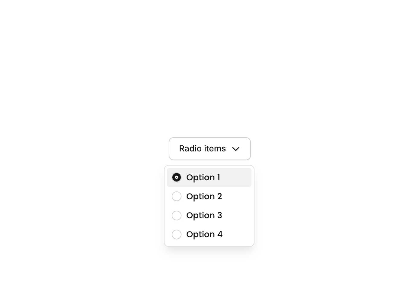
Dropdown 06 is a custom dropdown component featuring radio button-style selection. It displays a GroupFocus overlay with multiple selectable options (Option 1, Option 2, Option 3), each containing a circular radio icon and a text label. When an option is clicked, a custom state tracks the selected item, and the radio icon updates visually to reflect the active selection. It supports hover and disabled states per option row.
How to use
Open the Brikl panel
Navigate to the Elements category in the Brikl panel.
Copy the component
Find Dropdown 06 and click Copy.
Paste into your editor
Paste it into your Bubble canvas with Cmd + V (Mac) or Ctrl + V (Windows),
or right-click on the canvas and select Paste.
States
This component includes conditional states that automatically change its appearance.
| State | Trigger | Visual effect |
|---|
| Hovered Option | Mouse hover over an option group | Background color of the hovered option changes to rgba(245,244,244,1) |
| Disabled Option | Option group is not clickable (isnt_clickable condition) | Opacity of the option group is reduced to 50% |
| Selected Radio | items_selected_ custom state matches the item_ value of the option | Radio icon changes to a filled dot (phosphor fill dot) with dark background rgba(27,23,24,1) |
These states are handled natively by Bubble and require no additional setup.
They will work automatically once the component is pasted into your editor.
Responsive
This component adapts to mobile screens. Font sizes and layout automatically adjust on screens smaller than Bubble’s built-in mobile breakpoint.
Workflows
This component includes pre-built workflows.
| Trigger | Action |
|---|
| Group - Option 1 (Radio) clicked | Sets items_selected_ custom state on the GroupFocus: if Option 1 is already selected, clears the value to 0; otherwise sets it to Option 1’s item_ value (1) |
| Group - Option 2 (Radio) clicked | Sets items_selected_ custom state on the GroupFocus: if Option 2 is already selected, clears the value to 0; otherwise sets it to Option 2’s item_ value (2) |
| Group - Option 3 (Radio) clicked | Sets items_selected_ custom state on the GroupFocus: if Option 3 is already selected, clears the value to 0; otherwise sets it to Option 3’s item_ value (3) |
These workflows are included when you use the Copy with Workflows option in the Brikl panel.
Requirements
| |
|---|
| License | Starter plan required |
| Plugins | None |
| Custom code | Not required |
| Platform | Supported |
|---|
| Web | ✅ |
| Mobile | ❌ |
License
This component requires a Starter plan.