Overview
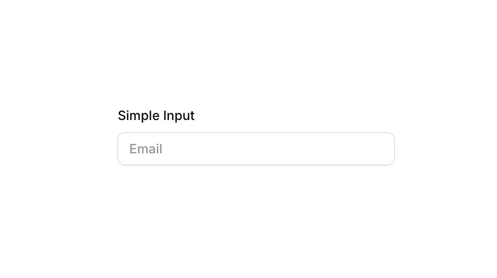
Input 01 is a simple, clean text input component consisting of a label (‘Simple Input’) and a single-line input field with placeholder text (‘Email’). It is designed for capturing user text entries such as email addresses or other short-form data. The component includes focus, validation error, and disabled visual states, making it suitable for forms requiring basic input with clear user feedback.
How to use
Open the Brikl panel
Navigate to the Elements category in the Brikl panel.
Copy the component
Find Input 01 and click Copy.
Paste into your editor
Paste it into your Bubble canvas with Cmd + V (Mac) or Ctrl + V (Windows),
or right-click on the canvas and select Paste.
States
This component includes conditional states that automatically change its appearance.
| State | Trigger | Visual effect |
|---|
| Focused | Input element is focused by the user | Adds a soft box shadow (rgba(216,211,212,0.5)) with spread of 3 around the input field |
| Invalid | Input value fails validation | Border turns red (rgba(251,44,54,1)) and a red-tinted box shadow (rgba(251,44,54,0.2)) appears around the input |
| Disabled | Input is not clickable | Input opacity is reduced to 50%, indicating a non-interactive state |
These states are handled natively by Bubble and require no additional setup.
They will work automatically once the component is pasted into your editor.
Responsive
This component adapts to mobile screens. Font sizes and layout automatically adjust on screens smaller than Bubble’s built-in mobile breakpoint.
Requirements
| |
|---|
| License | Free |
| Plugins | None |
| Custom code | Not required |
| Platform | Supported |
|---|
| Web | ✅ |
| Mobile | ✅ |
License
This component is available on the free plan.