Overview
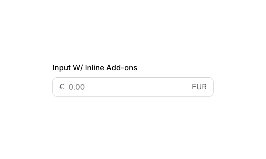
Input 09 is a styled numeric input field with inline add-ons, designed for currency or numeric data entry. It features a left-side currency symbol (€) and a right-side currency label (EUR) embedded within the input container, providing clear context for the value being entered. The component supports focus, validation error, and disabled visual states, making it suitable for financial forms or any scenario requiring formatted numeric input.
How to use
Open the Brikl panel
Navigate to the Elements category in the Brikl panel.
Copy the component
Find Input 09 and click Copy.
Paste into your editor
Paste it into your Bubble canvas with Cmd + V (Mac) or Ctrl + V (Windows), or right-click on the canvas and select Paste.
States
This component includes conditional states that automatically change its appearance.
| State | Trigger | Visual effect |
|---|
| Focused | Input field is focused by the user | Adds a soft box shadow (rgba(216,211,212,0.5)) around the input group to indicate active focus |
| Invalid | Input field value fails validation | Border color changes to red (rgba(251,44,54,1)) and a red box shadow (rgba(251,44,54,0.2)) appears around the group |
| Disabled | Input field is not clickable | The input group opacity is reduced to 50%, visually indicating a disabled state |
| Mobile Breakpoint | Current page width is less than the built-in mobile breakpoint | Font size of label and add-on text elements adjusts to 14px for mobile screens |
These states are handled natively by Bubble and require no additional setup. They will work automatically once the component is pasted into your editor.
Responsive
This component adapts to mobile screens. Font sizes and layout automatically adjust on screens smaller than Bubble’s built-in mobile breakpoint.
Requirements
| |
|---|
| License | Starter plan required |
| Plugins | None |
| Custom code | Not required |
| Platform | Supported |
|---|
| Web | ✅ |
| Mobile | ✅ |
License
This component is available on the free plan.