Overview
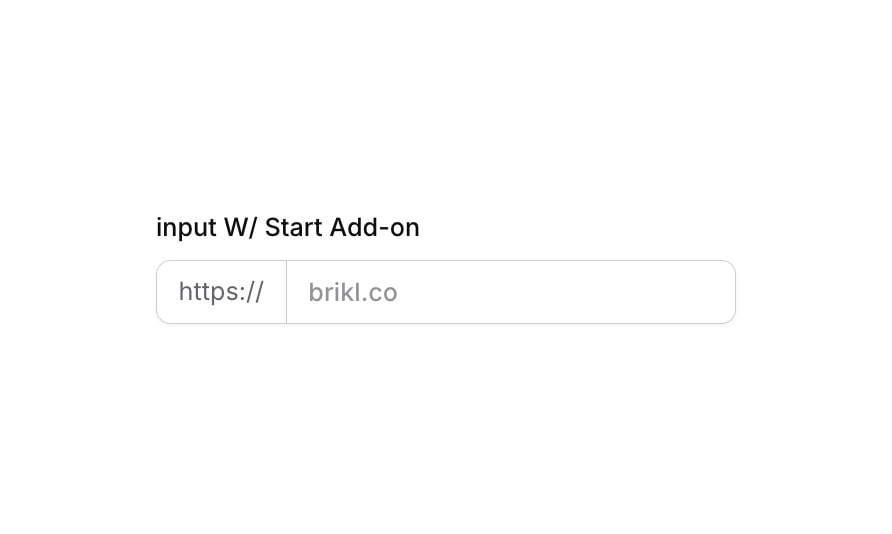
Input 10 is a labeled text input component featuring a start add-on (prefix) element displaying ‘https://’ alongside the input field. It is designed for URL-style inputs where a fixed prefix is shown visually separated but attached to the left side of the input. The component includes focus, validation error, and disabled states with smooth transitions, making it suitable for forms requiring prefixed text entry.
How to use
Open the Brikl panel
Navigate to the Elements category in the Brikl panel.
Copy the component
Find Input 10 and click Copy.
Paste into your editor
Paste it into your Bubble canvas with Cmd + V (Mac) or Ctrl + V (Windows), or right-click on the canvas and select Paste.
States
This component includes conditional states that automatically change its appearance.
| State | Trigger | Visual effect |
|---|
| Focused | Input element receives focus | Adds a colored box shadow (rgba(216,211,212,0.5)) with spread of 3 and solid left border to highlight the active input |
| Invalid | Input fails validation (isnt_valid) | Applies a red-tinted box shadow (rgba(251,44,54,0.2)) with spread of 3 to indicate an error state |
| Disabled | Input is not clickable (isnt_clickable) | Reduces opacity to 50% to visually indicate the input is non-interactive |
| Mobile Breakpoint | Current page width is less than built-in-mobile breakpoint | Adjusts font size to 14px for label and add-on text elements |
These states are handled natively by Bubble and require no additional setup. They will work automatically once the component is pasted into your editor.
Responsive
This component adapts to mobile screens. Font sizes and layout automatically adjust on screens smaller than Bubble’s built-in mobile breakpoint.
Requirements
| |
|---|
| License | Starter plan required |
| Plugins | None |
| Custom code | Not required |
| Platform | Supported |
|---|
| Web | ✅ |
| Mobile | ✅ |
License
This component is available on the free plan.