Overview
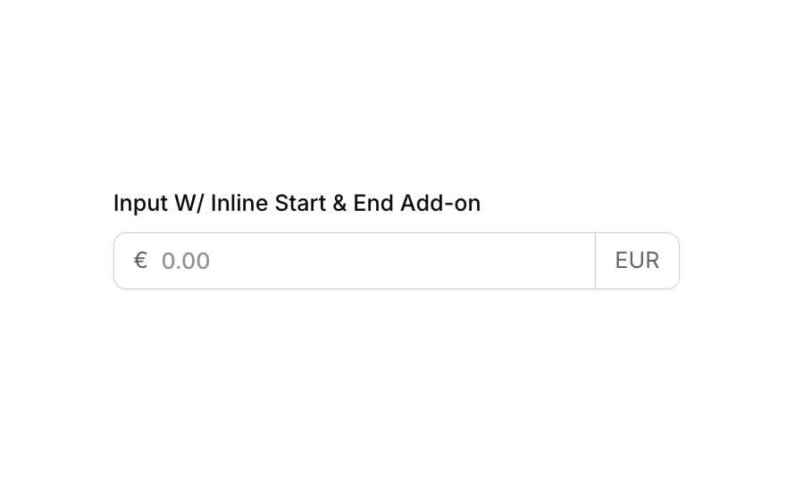
Input 12 is a styled currency input component featuring inline start and end add-ons. It displays a euro sign (€) on the left and a currency label (EUR) on the right, wrapped in a rounded bordered container. It supports float number input format and includes visual states for focus, validation error, and disabled interaction, making it ideal for financial or pricing forms.
How to use
Open the Brikl panel
Navigate to the Elements category in the Brikl panel.
Copy the component
Find Input 12 and click Copy.
Paste into your editor
Paste it into your Bubble canvas with Cmd + V (Mac) or Ctrl + V (Windows), or right-click on the canvas and select Paste.
States
This component includes conditional states that automatically change its appearance.
| State | Trigger | Visual effect |
|---|
| Focused | Input element receives focus | Adds a soft box shadow (rgba(216,211,212,0.5)) around the input container to indicate active focus |
| Invalid | Input fails validation (isnt_valid) | Border color changes to red (rgba(251,44,54,1)) and a red box shadow (rgba(251,44,54,0.2)) appears around the container |
| Disabled | Input is not clickable (isnt_clickable) | Container opacity reduces to 50%, visually indicating the input is disabled |
| Mobile Responsive | Current page width is less than built-in mobile breakpoint | Font size of label and add-on text elements adjusts to 14px for mobile screens |
These states are handled natively by Bubble and require no additional setup. They will work automatically once the component is pasted into your editor.
Responsive
This component adapts to mobile screens. Font sizes and layout automatically adjust on screens smaller than Bubble’s built-in mobile breakpoint.
Requirements
| |
|---|
| License | Starter plan required |
| Plugins | None |
| Custom code | Not required |
| Platform | Supported |
|---|
| Web | ✅ |
| Mobile | ✅ |
License
This component is available on the free plan.