Overview
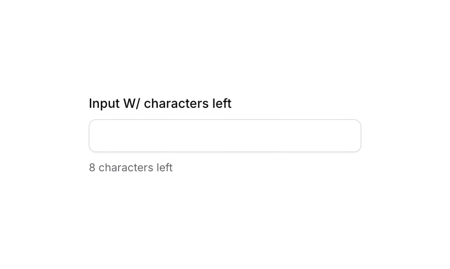
Input 17 is a text input component with a real-time character countdown feature. It displays a label above the input field and shows the number of remaining characters (out of a 50-character limit) below it. The component includes focus and validation states with visual feedback via box shadows and border color changes, making it ideal for forms where character limits need to be communicated clearly to the user.
How to use
Open the Brikl panel
Navigate to the Elements category in the Brikl panel.
Copy the component
Find Input 17 and click Copy.
Paste into your editor
Paste it into your Bubble canvas with Cmd + V (Mac) or Ctrl + V (Windows), or right-click on the canvas and select Paste.
States
This component includes conditional states that automatically change its appearance.
| State | Trigger | Visual effect |
|---|
| Focused | Input is focused by the user | Adds a soft box shadow (rgba(216,211,212,0.5)) with spread of 3 around the input field |
| Invalid | Input value is not valid | Border color changes to red (rgba(251,44,54,1)) and a red-tinted box shadow appears around the input |
| Disabled | Input is not clickable | Input opacity reduces to 50%, indicating a disabled state |
| Mobile Breakpoint | Current page width is less than the built-in mobile breakpoint | Font size of label and character count text adjusts to 14px for smaller screens |
These states are handled natively by Bubble and require no additional setup. They will work automatically once the component is pasted into your editor.
Responsive
This component adapts to mobile screens. Font sizes and layout automatically adjust on screens smaller than Bubble’s built-in mobile breakpoint.
Requirements
| |
|---|
| License | Starter plan required |
| Plugins | None |
| Custom code | Not required |
| Platform | Supported |
|---|
| Web | ✅ |
| Mobile | ✅ |
License
This component is available on the free plan.