Overview
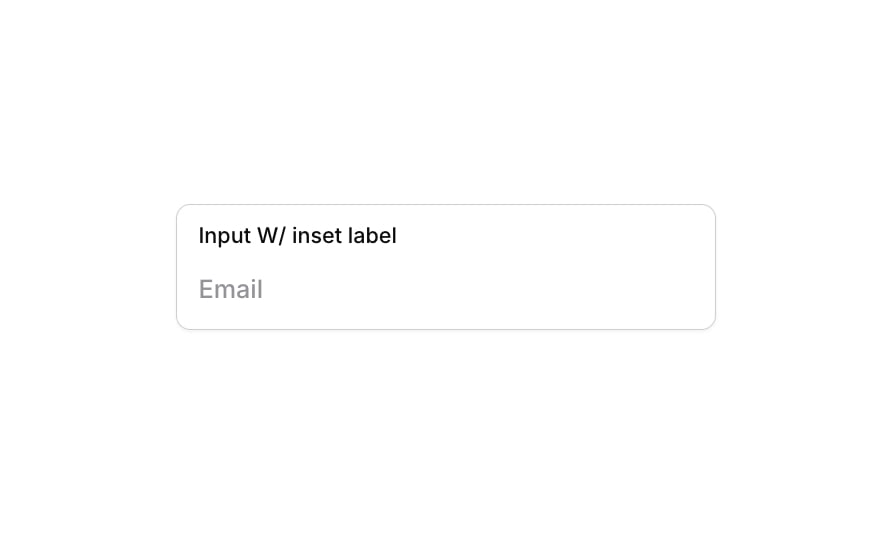
Input 21 is a labeled input field component featuring an inset label displayed above the input box within a styled container group. It is designed for form use cases such as collecting email or text data, with visual feedback states for focus, validation errors, and disabled interactions. The container has a subtle shadow, rounded corners, and smooth transitions for a polished user experience.
How to use
Open the Brikl panel
Navigate to the Elements category in the Brikl panel.
Copy the component
Find Input 21 and click Copy.
Paste into your editor
Paste it into your Bubble canvas with Cmd + V (Mac) or Ctrl + V (Windows), or right-click on the canvas and select Paste.
States
This component includes conditional states that automatically change its appearance.
| State | Trigger | Visual effect |
|---|
| Focused | Input field receives focus (is_focused) | Adds a soft box shadow (rgba(216,211,212,0.5), spread 3) around the container group |
| Invalid | Input field fails validation (isnt_valid) | Changes border color to red (rgba(251,44,54,1)) and adds a red-tinted box shadow (rgba(251,44,54,0.2), spread 3) |
| Disabled | Input field is not clickable (isnt_clickable) | Reduces the container opacity to 50%, visually indicating a disabled state |
These states are handled natively by Bubble and require no additional setup. They will work automatically once the component is pasted into your editor.
Responsive
This component adapts to mobile screens. Font sizes and layout automatically adjust on screens smaller than Bubble’s built-in mobile breakpoint.
Requirements
| |
|---|
| License | Starter plan required |
| Plugins | None |
| Custom code | Not required |
| Platform | Supported |
|---|
| Web | ✅ |
| Mobile | ✅ |
License
This component is available on the free plan.