Overview
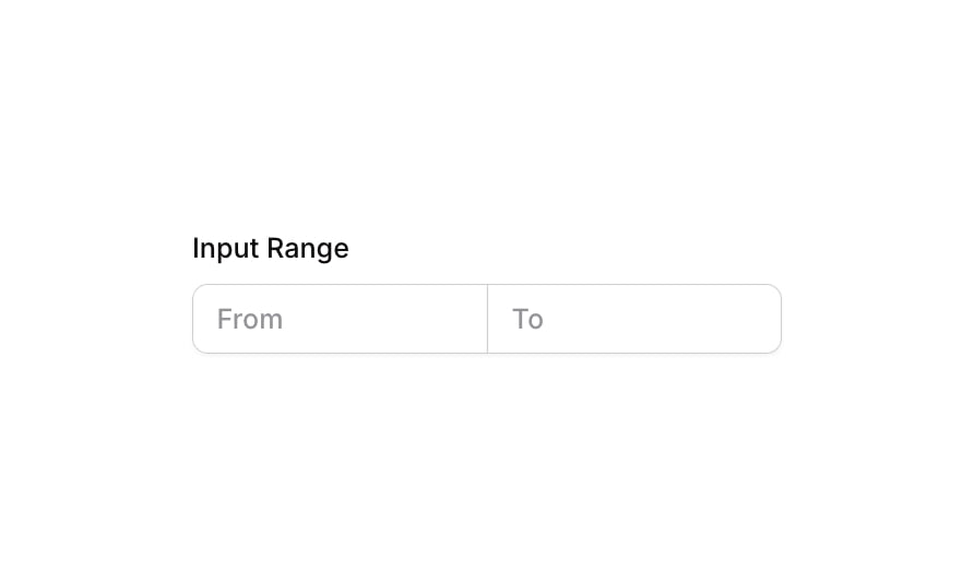
Input 22 is a range input component designed to capture a numerical range from the user. It consists of a labeled group containing two side-by-side input fields: one for the starting value (‘From’) and one for the ending value (‘To’). The inputs share a connected border style, creating a unified range control. It supports validation states, focus highlights, and disabled appearance, making it suitable for filter panels, search forms, or any UI requiring a min/max numerical range entry.
How to use
Open the Brikl panel
Navigate to the Elements category in the Brikl panel.
Copy the component
Find Input 22 and click Copy.
Paste into your editor
Paste it into your Bubble canvas with Cmd + V (Mac) or Ctrl + V (Windows), or right-click on the canvas and select Paste.
States
This component includes conditional states that automatically change its appearance.
| State | Trigger | Visual effect |
|---|
| Focused | User clicks or focuses on the ‘From’ or ‘To’ input field | A soft border-color highlight and spread box shadow (rgba(216,211,212,0.5)) appears around the focused input |
| Invalid | Input fails validation (isnt_valid condition) | A red-tinted box shadow (rgba(251,44,54,0.2)) with spread appears around the invalid input |
| Disabled | Input is not clickable (isnt_clickable condition) | The input opacity is reduced to 50%, visually indicating it is inactive |
| Mobile Breakpoint | Current page width is less than the built-in mobile breakpoint | The label text font size adjusts to 14px for smaller screens |
These states are handled natively by Bubble and require no additional setup. They will work automatically once the component is pasted into your editor.
Responsive
This component adapts to mobile screens. Font sizes and layout automatically adjust on screens smaller than Bubble’s built-in mobile breakpoint.
Requirements
| |
|---|
| License | Starter plan required |
| Plugins | None |
| Custom code | Not required |
| Platform | Supported |
|---|
| Web | ✅ |
| Mobile | ✅ |
License
This component is available on the free plan.