Overview
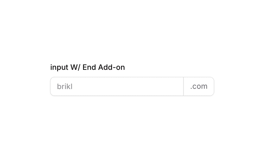
Input 11 is a styled text input component featuring an end add-on (e.g., ‘.com’) appended to the right side of the input field. It includes a label above the input, a placeholder, rounded corners on the appropriate sides to visually merge the input and add-on into a single unit, and multiple visual states for focus, validation error, and disabled interactions.
How to use
Open the Brikl panel
Navigate to the Elements category in the Brikl panel.
Copy the component
Find Input 11 and click Copy.
Paste into your editor
Paste it into your Bubble canvas with Cmd + V (Mac) or Ctrl + V (Windows), or right-click on the canvas and select Paste.
States
This component includes conditional states that automatically change its appearance.
| State | Trigger | Visual effect |
|---|
| Focused | Input element is focused by the user | Applies a colored box shadow and solid border on the left to highlight the active input |
| Invalid | Input fails validation (isnt_valid) | Applies a red-tinted box shadow to indicate an error state |
| Disabled | Input is not clickable (isnt_clickable) | Reduces opacity to 50% to visually indicate the input is inactive |
| Mobile Breakpoint | Current page width is less than the built-in mobile breakpoint | Adjusts font size on text elements to 14px for smaller screens |
These states are handled natively by Bubble and require no additional setup. They will work automatically once the component is pasted into your editor.
Responsive
This component adapts to mobile screens. Font sizes and layout automatically adjust on screens smaller than Bubble’s built-in mobile breakpoint.
Requirements
| |
|---|
| License | Starter plan required |
| Plugins | None |
| Custom code | Not required |
| Platform | Supported |
|---|
| Web | ✅ |
| Mobile | ✅ |
License
This component is available on the free plan.