Overview
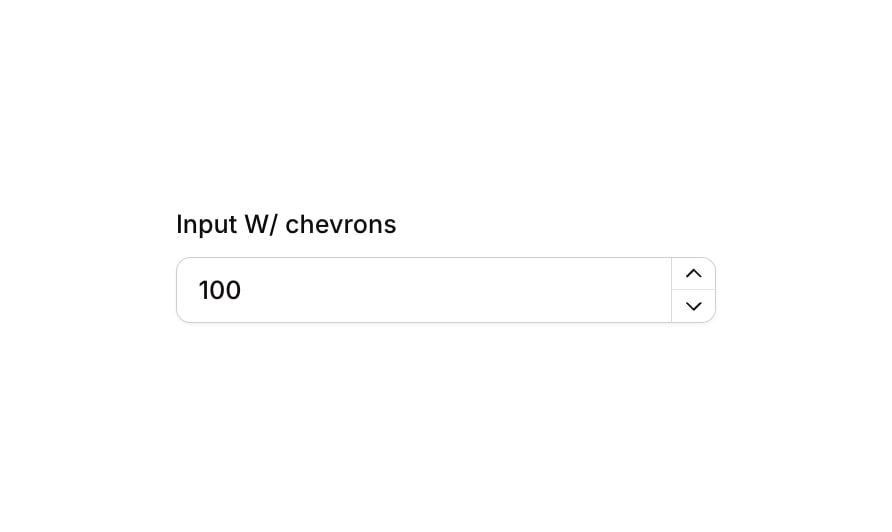
Input 19 is a numeric currency input component with increment/decrement chevron buttons. It features a styled text input for currency values alongside two vertically stacked arrow buttons (up and down carets) that allow users to adjust the value. The component includes a label, focus state with shadow highlight, validation error state with red border, and a disabled/non-clickable state with reduced opacity.How to use
1
Open the Brikl panel
Navigate to the Elements category in the Brikl panel.
2
Copy the component
Find Input 19 and click Copy.
3
Paste into your editor
Paste it into your Bubble canvas with
Cmd + V (Mac) or Ctrl + V (Windows), or right-click on the canvas and select Paste.States
This component includes conditional states that automatically change its appearance.These states are handled natively by Bubble and require no additional setup. They will work automatically once the component is pasted into your editor.
Responsive
This component adapts to mobile screens. Font sizes and layout automatically adjust on screens smaller than Bubble’s built-in mobile breakpoint.Requirements
Platforms
License
This component is available on the free plan.