Overview
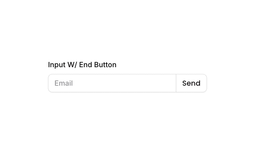
Input 13 is a labeled email input component with an integrated end button. It features a text label (‘Input W/ End Button’), a styled text input field with placeholder ‘Email’, and a ‘Send’ button with an arrow icon attached to the right side of the input. The layout uses a column container for the label and a row container for the input-button pair, making it suitable for email capture, search, or form submission use cases.
How to use
Open the Brikl panel
Navigate to the Elements category in the Brikl panel.
Copy the component
Find Input 13 and click Copy.
Paste into your editor
Paste it into your Bubble canvas with Cmd + V (Mac) or Ctrl + V (Windows), or right-click on the canvas and select Paste.
States
This component includes conditional states that automatically change its appearance.
| State | Trigger | Visual effect |
|---|
| Input Focused | Input field receives focus | Border color changes to rgba(216,211,212,1) with a soft box shadow spread of 3px |
| Input Invalid | Input field value is not valid | Red-tinted box shadow (rgba(251,44,54,0.2)) with spread of 3px appears around the input |
| Input Disabled | Input is not clickable | Input opacity reduces to 50% |
| Button Hovered | Mouse hovers over the Send button | Button background color changes to rgba(245,244,244,1) |
| Button Disabled | Send button is not clickable | Button opacity reduces to 50% |
These states are handled natively by Bubble and require no additional setup. They will work automatically once the component is pasted into your editor.
Responsive
This component adapts to mobile screens. Font sizes and layout automatically adjust on screens smaller than Bubble’s built-in mobile breakpoint.
Requirements
| |
|---|
| License | Starter plan required |
| Plugins | None |
| Custom code | Not required |
| Platform | Supported |
|---|
| Web | ✅ |
| Mobile | ✅ |
License
This component is available on the free plan.