Overview
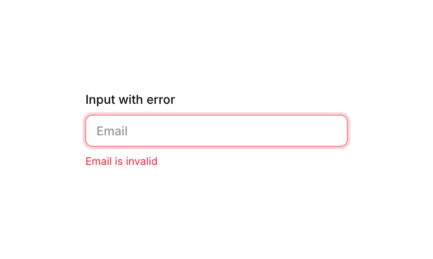
Input 06 is a form input component designed to collect user text data (e.g., email) with built-in validation feedback. It displays a label above the input, applies visual focus and error states to the input field (red border and shadow when invalid), and shows an error message text beneath the input when the field is empty or invalid. It is suitable for forms requiring inline validation UI.
How to use
Open the Brikl panel
Navigate to the Elements category in the Brikl panel.
Copy the component
Find Input 06 and click Copy.
Paste into your editor
Paste it into your Bubble canvas with Cmd + V (Mac) or Ctrl + V (Windows),
or right-click on the canvas and select Paste.
States
This component includes conditional states that automatically change its appearance.
| State | Trigger | Visual effect |
|---|
| Focused | Input field is focused by the user | Applies a soft box shadow (rgba(216,211,212,0.5), spread 3) around the input field |
| Error / Empty | Input field’s data is empty (mandatory field not filled) | Input border changes to red (rgba(251,44,54,1)) and a red box shadow (rgba(251,44,54,0.2), spread 3) appears |
| Disabled | Input is not clickable | Input opacity reduces to 50%, visually indicating a disabled state |
| Error message hidden | Input field has a non-empty value | The error message text (‘Email is invalid’) becomes hidden/collapsed |
| Mobile font size | Current page width is less than the built-in mobile breakpoint | Font size of label and error text adjusts to 14px for mobile screens |
These states are handled natively by Bubble and require no additional setup.
They will work automatically once the component is pasted into your editor.
Responsive
This component adapts to mobile screens. Font sizes and layout automatically adjust on screens smaller than Bubble’s built-in mobile breakpoint.
Requirements
| |
|---|
| License | Free |
| Plugins | None |
| Custom code | Not required |
| Platform | Supported |
|---|
| Web | ✅ |
| Mobile | ✅ |
License
This component is available on the free plan.