Overview
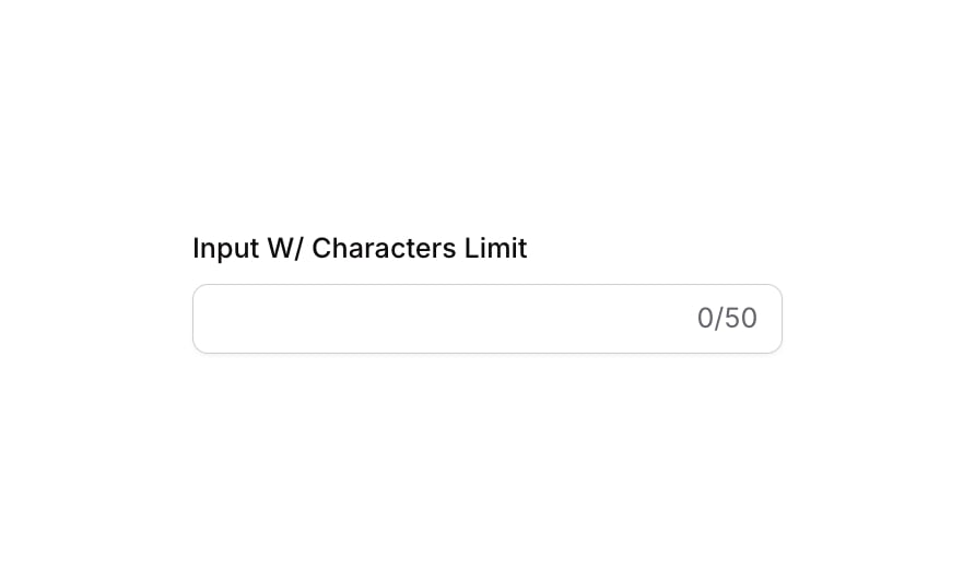
Input 16 is a text input component with a 50-character limit. It displays a label above the input field and a live character counter (e.g., ‘0/50’) below or beside the input. The component includes visual states for focused, invalid, and disabled conditions, making it suitable for form fields where input length needs to be constrained and communicated to the user.How to use
1
Open the Brikl panel
Navigate to the Elements category in the Brikl panel.
2
Copy the component
Find Input 16 and click Copy.
3
Paste into your editor
Paste it into your Bubble canvas with
Cmd + V (Mac) or Ctrl + V (Windows), or right-click on the canvas and select Paste.States
This component includes conditional states that automatically change its appearance.These states are handled natively by Bubble and require no additional setup. They will work automatically once the component is pasted into your editor.
Responsive
This component adapts to mobile screens. Font sizes and layout automatically adjust on screens smaller than Bubble’s built-in mobile breakpoint.Requirements
Platforms
License
This component is available on the free plan.