Overview
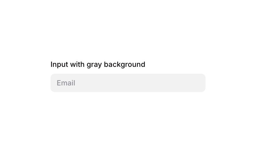
Input 04 is a simple, styled text input component with a gray background designed for collecting user text data such as an email address. It features a label above the input, a placeholder, rounded corners, and a subtle box shadow on focus, making it suitable for forms on both web and mobile interfaces.
How to use
Open the Brikl panel
Navigate to the Elements category in the Brikl panel.
Copy the component
Find Input 04 and click Copy.
Paste into your editor
Paste it into your Bubble canvas with Cmd + V (Mac) or Ctrl + V (Windows),
or right-click on the canvas and select Paste.
States
This component includes conditional states that automatically change its appearance.
| State | Trigger | Visual effect |
|---|
| Focused | Input element receives focus (is_focused) | Border becomes solid with color rgba(216,211,212,1) and a spread box shadow rgba(216,211,212,0.5) appears around the input |
These states are handled natively by Bubble and require no additional setup.
They will work automatically once the component is pasted into your editor.
Responsive
This component adapts to mobile screens. Font sizes and layout automatically adjust on screens smaller than Bubble’s built-in mobile breakpoint.
Requirements
| |
|---|
| License | Free |
| Plugins | None |
| Custom code | Not required |
| Platform | Supported |
|---|
| Web | ✅ |
| Mobile | ✅ |
License
This component is available on the free plan.