Overview
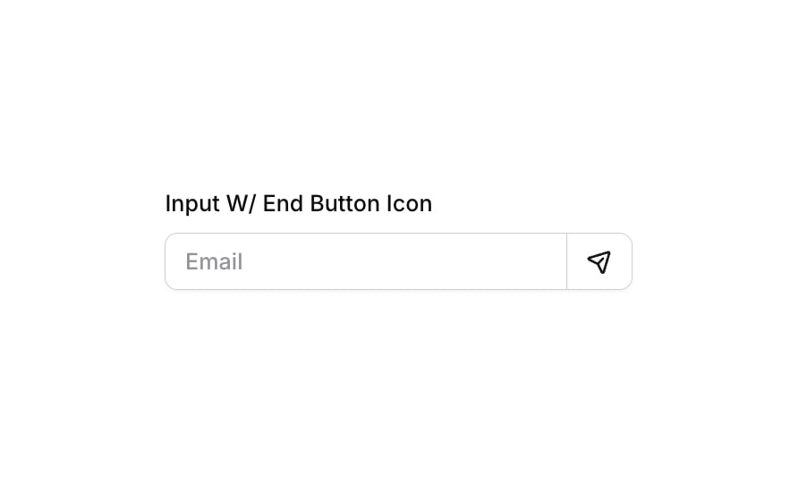
Input 14 is a styled text input component with an integrated end icon button (Send), designed to allow users to type content and trigger an action directly from the input row. It features a label above, a text input on the left, and a bordered icon button on the right that shares the input’s border for a seamless connected appearance. Common use cases include email subscription forms, search bars, or message-sending interfaces.
How to use
Open the Brikl panel
Navigate to the Elements category in the Brikl panel.
Copy the component
Find Input 14 and click Copy.
Paste into your editor
Paste it into your Bubble canvas with Cmd + V (Mac) or Ctrl + V (Windows), or right-click on the canvas and select Paste.
States
This component includes conditional states that automatically change its appearance.
| State | Trigger | Visual effect |
|---|
| Input Focused | User clicks or focuses the input field | A colored box shadow (rgba(216,211,212,0.5)) with spread 3 appears around the input, and the left border becomes solid with rgba(216,211,212,1) |
| Input Invalid | Input fails validation (isnt_valid) | A red-tinted box shadow (rgba(251,44,54,0.2)) with spread 3 appears around the input |
| Input Disabled | Input is not clickable (isnt_clickable) | Input opacity reduces to 50% |
| Button Hovered | User hovers over the Send button | Button background changes to rgba(245,244,244,1) and icon color darkens to rgba(27,23,24,1) |
| Button Disabled | Button is not clickable (isnt_clickable) | Button opacity reduces to 50% |
These states are handled natively by Bubble and require no additional setup. They will work automatically once the component is pasted into your editor.
Responsive
This component adapts to mobile screens. Font sizes and layout automatically adjust on screens smaller than Bubble’s built-in mobile breakpoint.
Requirements
| |
|---|
| License | Starter plan required |
| Plugins | None |
| Custom code | Not required |
| Platform | Supported |
|---|
| Web | ✅ |
| Mobile | ✅ |
License
This component is available on the free plan.