Overview
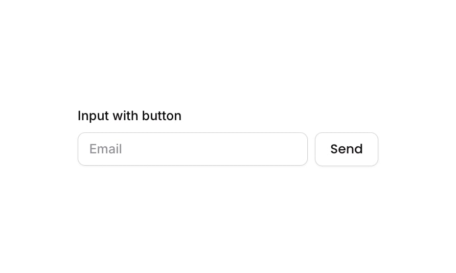
Input 15 is an ‘Input with Button’ component that combines a text input field (pre-configured for email) with an adjacent send button. It is designed for use cases like newsletter subscriptions, search bars, or email capture forms. The component includes a descriptive label above the input-button row and handles focused, invalid, and disabled states for the input, as well as hover and disabled states for the button.
How to use
Open the Brikl panel
Navigate to the Elements category in the Brikl panel.
Copy the component
Find Input 15 and click Copy.
Paste into your editor
Paste it into your Bubble canvas with Cmd + V (Mac) or Ctrl + V (Windows), or right-click on the canvas and select Paste.
States
This component includes conditional states that automatically change its appearance.
| State | Trigger | Visual effect |
|---|
| Input Focused | User clicks or tabs into the input field | A soft shadow (rgba(216,211,212,0.5)) spreads around the input border to indicate active focus |
| Input Invalid | Input value fails validation (isnt_valid) | Border turns red (rgba(251,44,54,1)) and a red shadow (rgba(251,44,54,0.2)) appears around the input |
| Input Disabled | Input is not clickable (isnt_clickable) | Input opacity reduces to 50%, visually indicating it is inactive |
| Button Hovered | User hovers over the Send button | Button background changes to rgba(245,244,244,1), a light grey tint |
| Button Disabled | Button is not clickable (isnt_clickable) | Button opacity reduces to 50%, visually indicating it is inactive |
| Mobile Breakpoint | Current page width is less than the built-in mobile breakpoint | Label text font size adjusts to 14px for smaller screens |
These states are handled natively by Bubble and require no additional setup. They will work automatically once the component is pasted into your editor.
Responsive
This component adapts to mobile screens. Font sizes and layout automatically adjust on screens smaller than Bubble’s built-in mobile breakpoint.
Requirements
| |
|---|
| License | Starter plan required |
| Plugins | None |
| Custom code | Not required |
| Platform | Supported |
|---|
| Web | ✅ |
| Mobile | ✅ |
License
This component is available on the free plan.