Overview
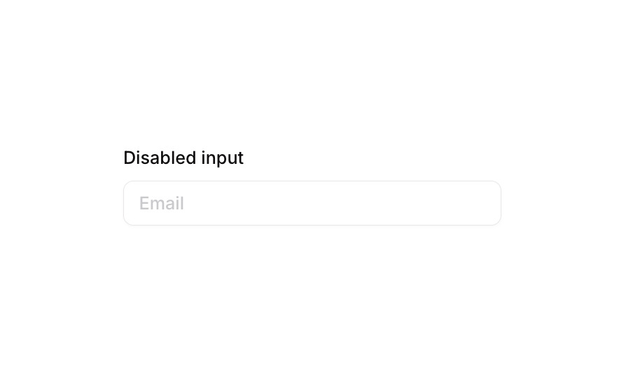
Input 05 is a disabled email input field component paired with a descriptive label. It is designed to visually communicate a non-interactive state to users, featuring a grayed-out appearance with opacity reduction when not clickable. The component includes conditional visual states for focus and validation error feedback, making it useful in forms where certain fields should be locked or read-only.
How to use
Open the Brikl panel
Navigate to the Elements category in the Brikl panel.
Copy the component
Find Input 05 and click Copy.
Paste into your editor
Paste it into your Bubble canvas with Cmd + V (Mac) or Ctrl + V (Windows),
or right-click on the canvas and select Paste.
States
This component includes conditional states that automatically change its appearance.
| State | Trigger | Visual effect |
|---|
| Focused | Input element is focused | Adds a soft box shadow (rgba(216,211,212,0.5)) with 3px spread around the input |
| Invalid | Input value is not valid | Border color changes to red (rgba(251,44,54,1)) and a red-tinted box shadow appears |
| Disabled / Not Clickable | Input is not clickable | Opacity reduces to 50%, visually indicating the field is non-interactive |
These states are handled natively by Bubble and require no additional setup.
They will work automatically once the component is pasted into your editor.
Responsive
This component adapts to mobile screens. Font sizes and layout automatically adjust on screens smaller than Bubble’s built-in mobile breakpoint.
Requirements
| |
|---|
| License | Free |
| Plugins | None |
| Custom code | Not required |
| Platform | Supported |
|---|
| Web | ✅ |
| Mobile | ✅ |
License
This component is available on the free plan.