Overview
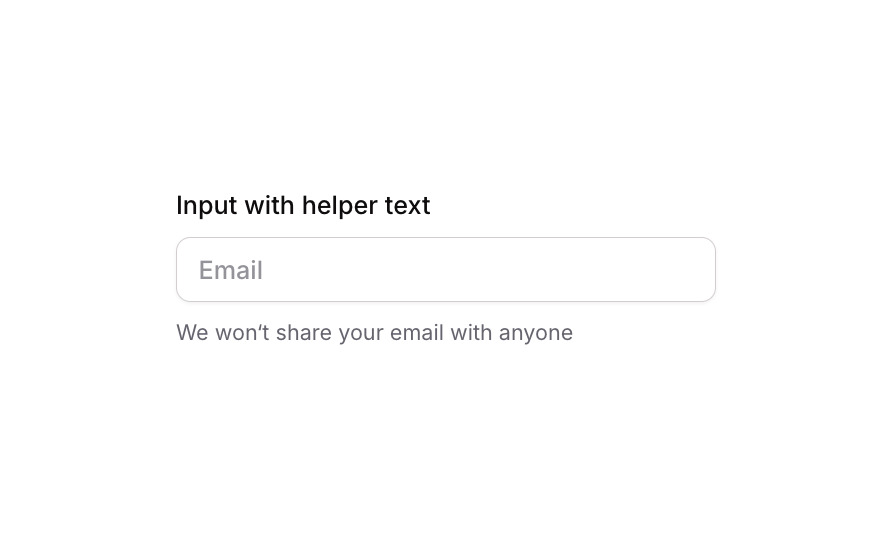
Input 02 is a labeled text input component with an accompanying helper text underneath. It is designed to collect user input (such as an email address) while providing contextual guidance via a subtitle message. The component includes focus and validation states for enhanced UX feedback.
How to use
Open the Brikl panel
Navigate to the Elements category in the Brikl panel.
Copy the component
Find Input 02 and click Copy.
Paste into your editor
Paste it into your Bubble canvas with Cmd + V (Mac) or Ctrl + V (Windows),
or right-click on the canvas and select Paste.
States
This component includes conditional states that automatically change its appearance.
| State | Trigger | Visual effect |
|---|
| Focused | Input element is focused by the user | Adds a soft box shadow around the input to indicate active focus |
| Invalid | Input fails validation (isnt_valid condition) | Border turns red (rgba(251,44,54,1)) and a red-tinted box shadow appears |
| Disabled | Input is not clickable (isnt_clickable condition) | Input opacity is reduced to 50% to indicate a disabled state |
| Mobile Breakpoint | Current page width is less than the built-in mobile breakpoint | Label and helper text font size adjusts to 14px for smaller screens |
These states are handled natively by Bubble and require no additional setup.
They will work automatically once the component is pasted into your editor.
Responsive
This component adapts to mobile screens. Font sizes and layout automatically adjust on screens smaller than Bubble’s built-in mobile breakpoint.
Requirements
| |
|---|
| License | Free |
| Plugins | None |
| Custom code | Not required |
| Platform | Supported |
|---|
| Web | ✅ |
| Mobile | ✅ |
License
This component is available on the free plan.